
Case Study
20,000+ Users in 2 Months - A Mental Health Platform for Anonymous Sharing
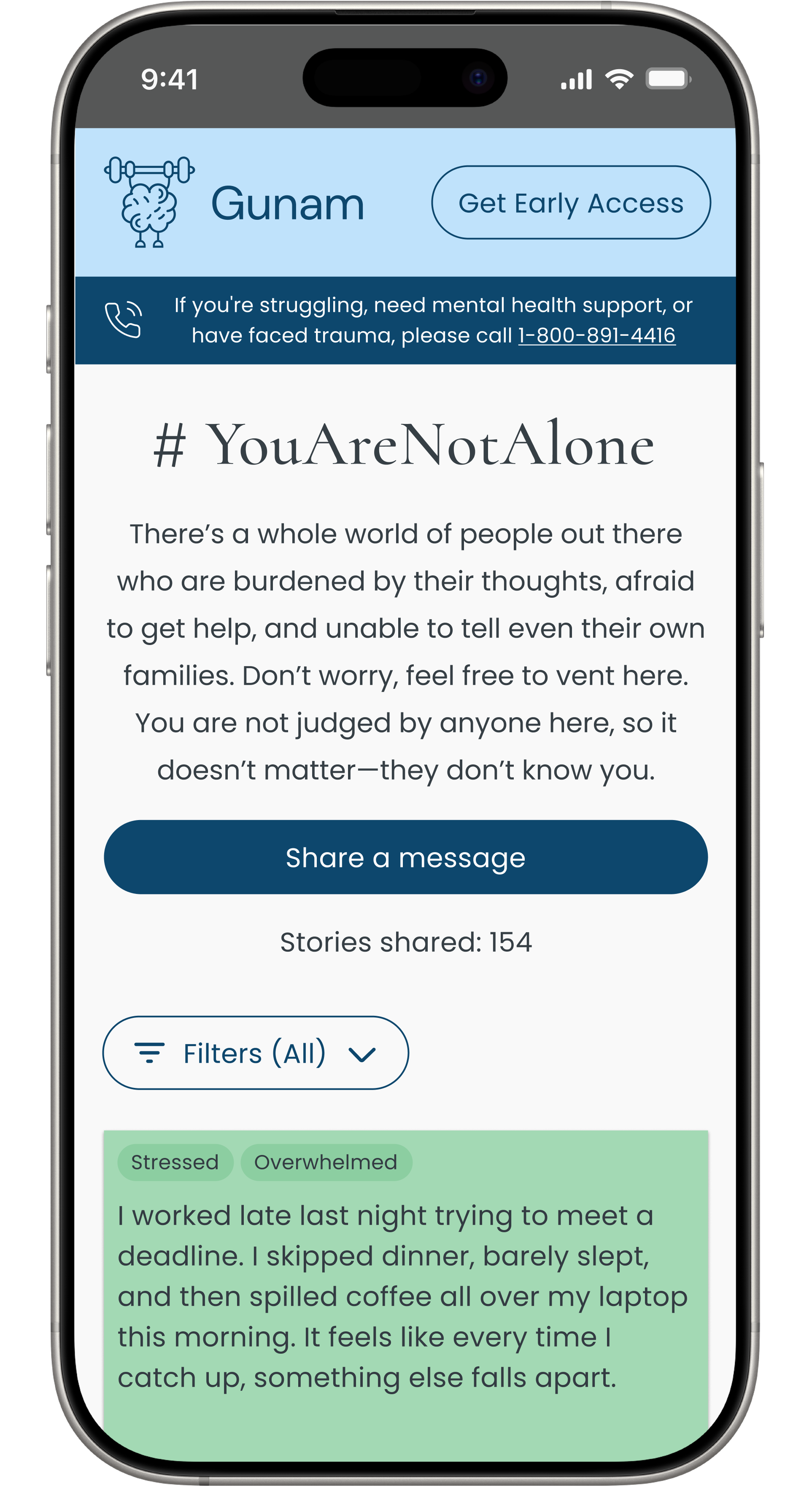
YouAreNotAlone: A responsive, user-centered digital platform empowering over 20,000 people to normalize mental health conversations in a safe space.
Team
Samaria Berry, Dennis Nguyen
Timeline
4 weeks
Tools
Figma, Figjam, Zoom
Role
UX/UI Designer, Researcher
Overview
As part of a client-based project through Designlab’s UX Academy, my teammate and I designed “YouAreNotAlone”—a temporary, interactive, responsive website for users to share their mental health experiences in a judgment-free, safe, and anonymous space.
This project was for Gunam, a mental health startup in India preparing to launch its online therapy services. The platform aimed to help users feel understood and less isolated while building awareness for Gunam’s offerings.
Challenge
In India, over 80% of people with mental health conditions avoid treatment due to stigma and fear of judgment, making it harder to share struggles openly and access help.
Impact
Over 20,000 Indian users engaged with Gunam’s sticky note platform in the first 4 months.
Heather wants to express her mental health struggles online without fear of judgment while feeling safe and supported.
HMW: How might we provide her with a secure and private space to share, reassurance that she’s not alone, and an easy way to connect with mental health services?
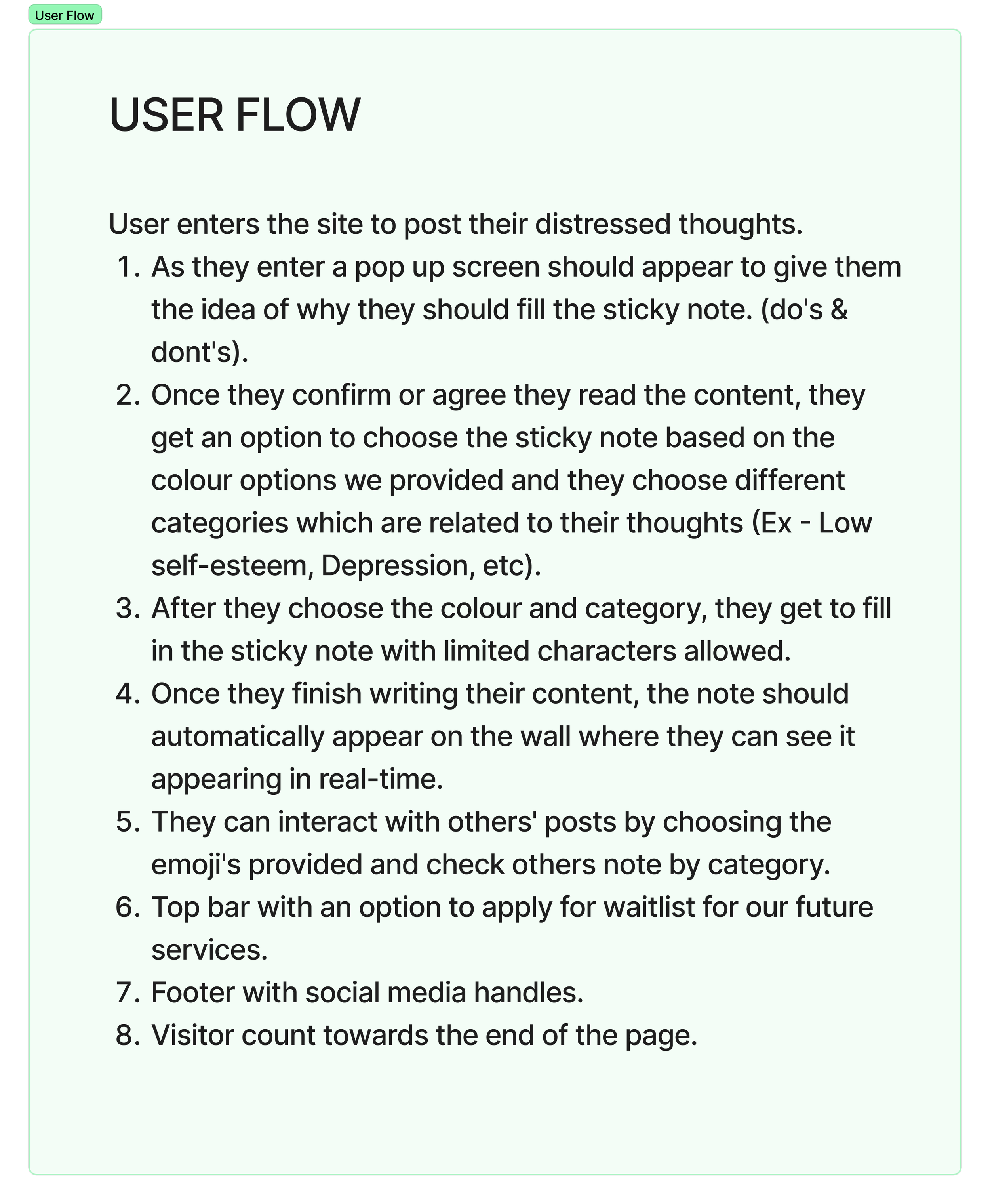
1. Discover
Understanding the client’s business goals and conducting user interviews.
Project Goals
Before beginning our research, we met with Gunam to gain a clear understanding of their business objectives.
1. Create a safe and supportive platform tailored to Indian users struggling with mental health.
2. Attract potential clients to Gunam’s upcoming online therapy and mental health services.
Establishing Creative Restraints in First Client Meeting
During this meeting, Gunam provided us with a detailed user flow, desired user experience, and technical requirements to guide our design process. While these guidelines limited our creative flexibility, they provided valuable structure and ensured our user interviews and design approach aligned with the platform’s vision and purpose.
Client requirements from email, pasted and structured in FigJam.
Conducting User Interview
How We Conducted Interviews
We conducted interviews (3 each) with six female participants with diverse backgrounds in their 20s and 30s and one in their early 50s. We wanted to explore their perceptions of mental health stigma and willingness to share personal thoughts.
Using a photo of a physical sticky note wall as a conversation starter, participants discussed their comfort levels with sharing in both physical and digital formats. The semi-structured interview covered topics such as anonymity, message content, and emotional safety.

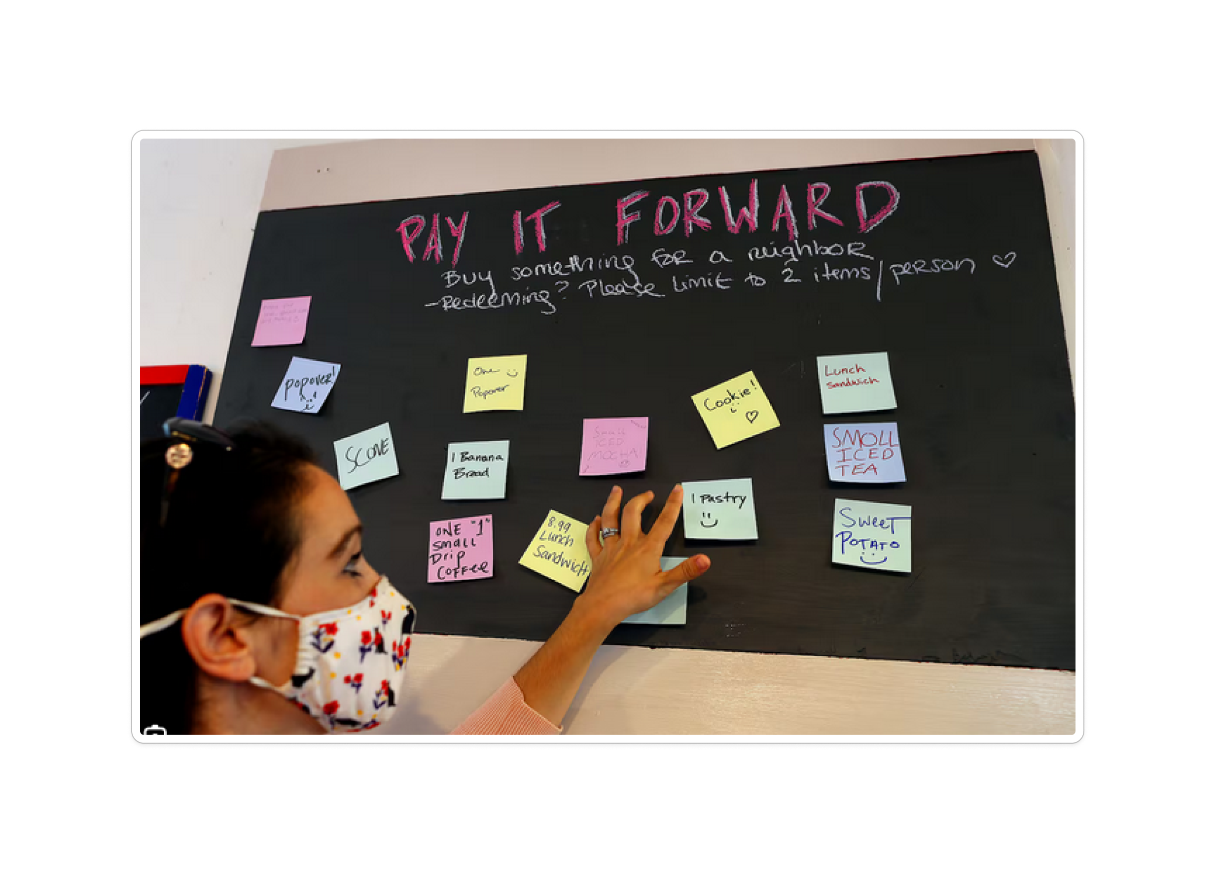
Images of sticky note walls used in interviews to spark conversation.
What We Discovered
Through user interviews, we gained insight into what would make users feel safe to share, what they would share, how they would interact, their concerns, and what would encourage them to consider signing up for mental health services on a digital platform.
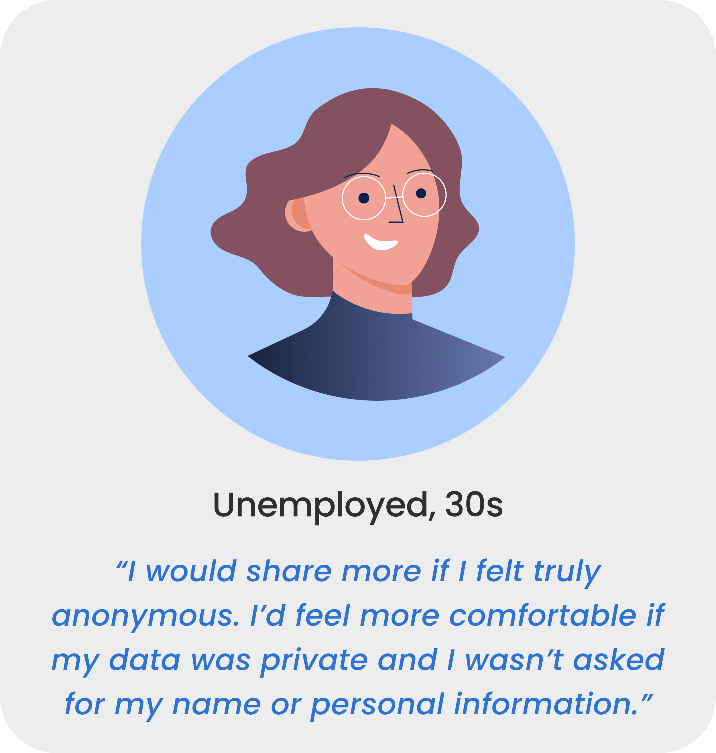
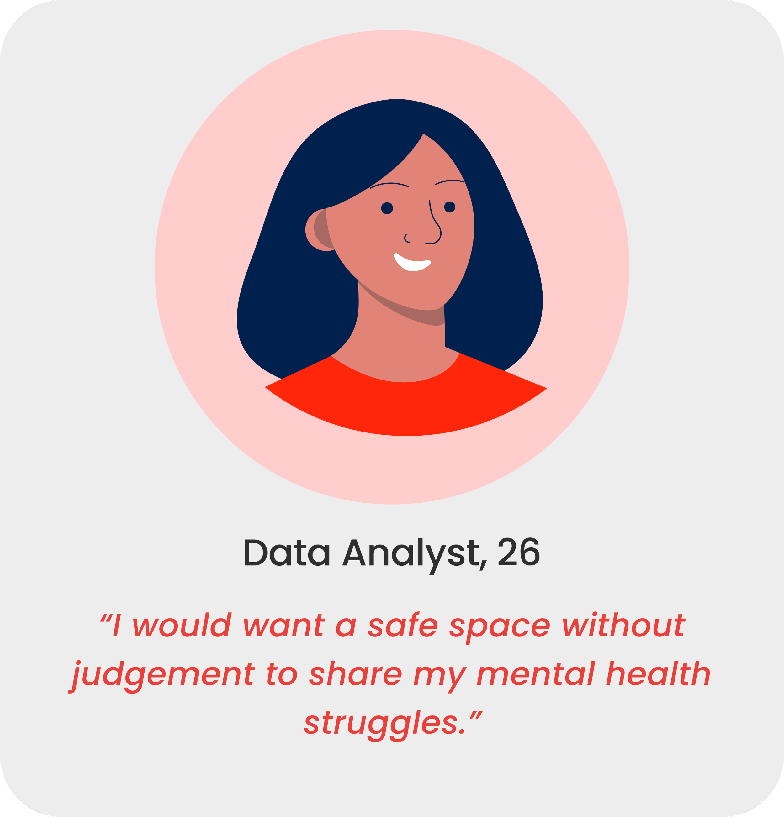

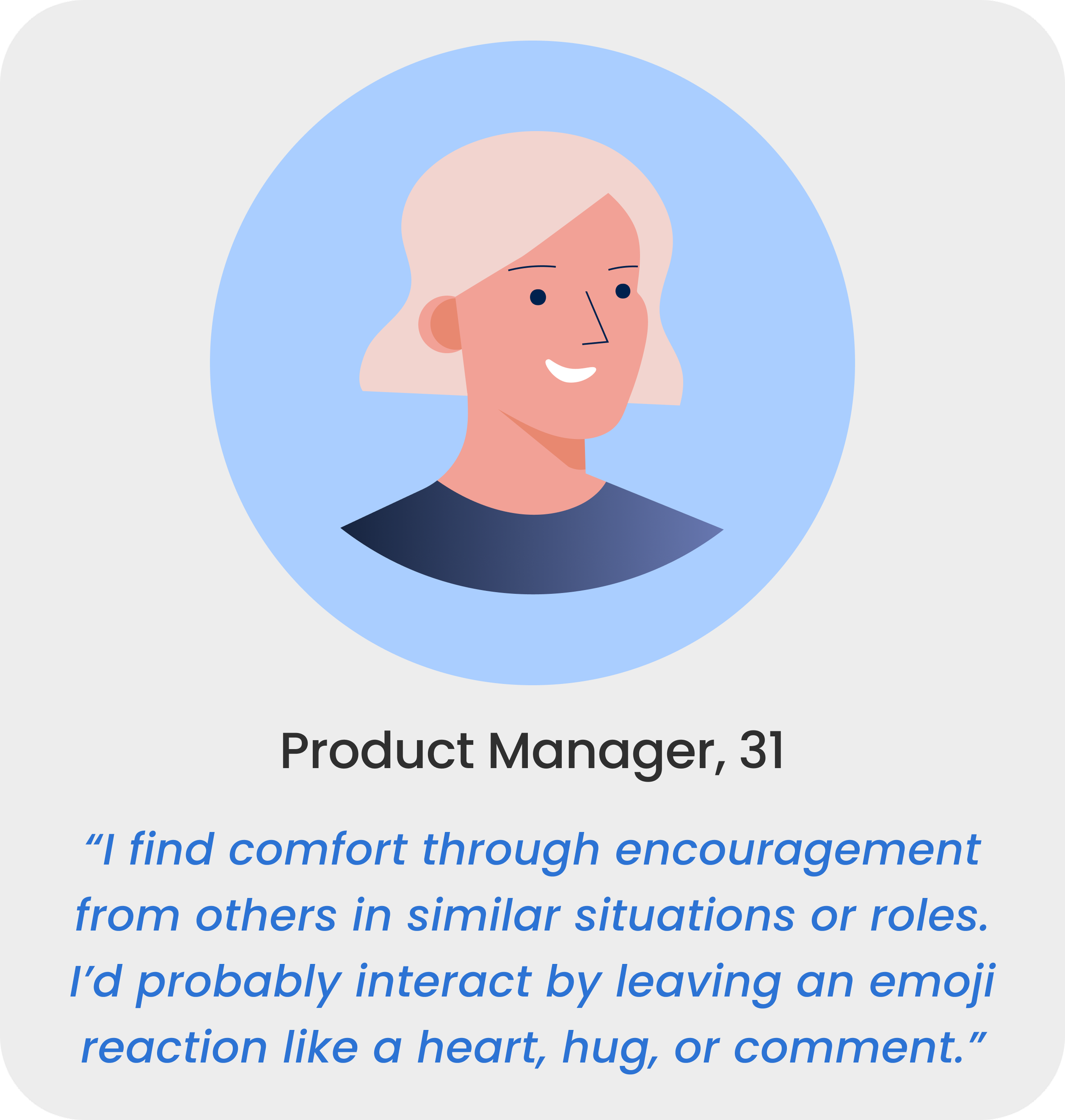
Insights from interviews on sharing behavior and platform expectations.
2. Define
Synthesizing user interview with affinity mapping and a user persona.
Synthesizing User interviews
Key Insights from Affinity Mapping
To uncover user needs and challenges, we used affinity mapping to group and organize research findings. Insights from participants highlighted the need for emotional safety, anonymity, and control in sharing experiences.
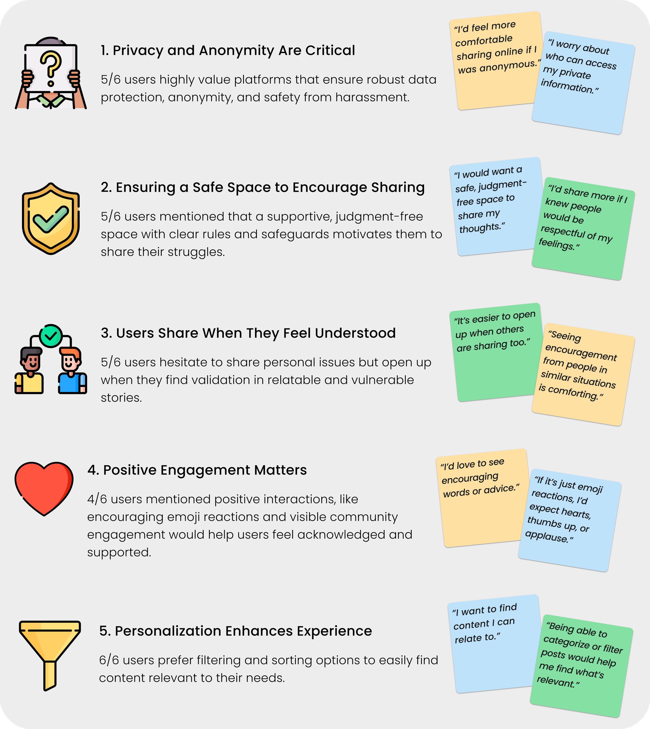
5 key insights from user interview.
Framing the Problems Through Our Persona
To design a supportive and secure space for mental health discussions, we focused on user needs around privacy, validation, and community. Research revealed that many individuals hesitate to share their struggles due to fear of judgment or data insecurity.
Our persona, Heather James, embodies these concerns—seeking a safe, anonymous environment where she can express herself freely while feeling validated and understood.
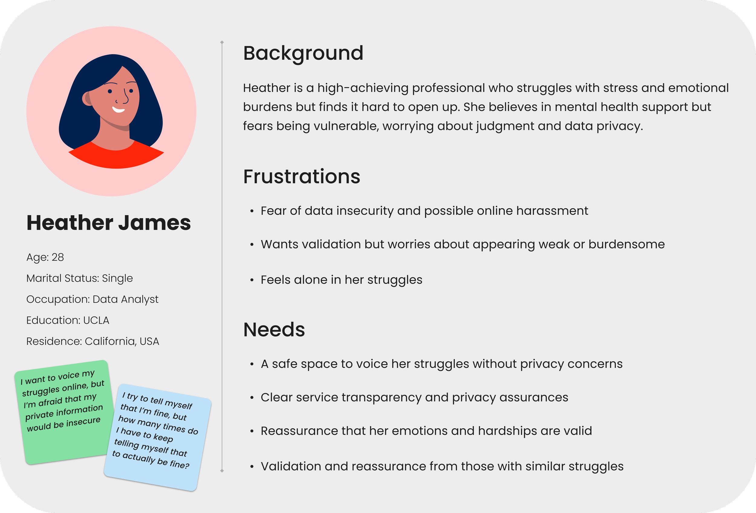
User persona highlighting emotional needs, privacy concerns, and barriers to sharing.
3. Develop
Prioritizing features and sketching.
Sketching Concepts to Solve Key Problems
To solve the core design challenges we started with rough sketches both on paper and digitally focusing on the sticky note wall and key user actions like creating a note and signing up for the waitlist.
We drew inspiration from physical sticky note walls and experimented with a random note layout, reflecting the client’s vision for a more organic, playful structure.
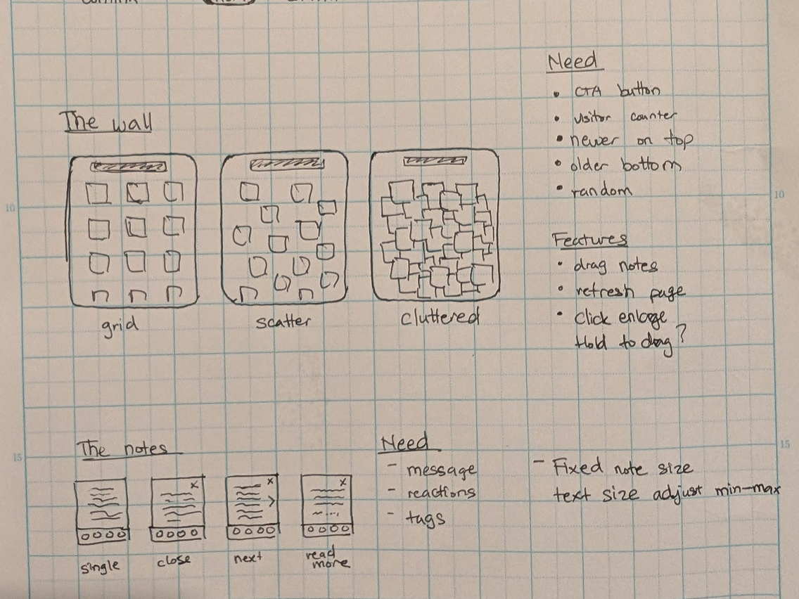
Early sketches of sticky note wall layouts for desktop view.

Early sketches of sticky note layout and create note flow.
We quickly iterated on different versions of the wall and how the notes could be positioned. Simultaneously, we mapped out the note creation flow, carefully considering the experience from start to finish. These sketches gave us a foundation to experiment and validate ideas before moving into wireframes.
Challenge: Working at different paces, my partner and I approached the project from different starting points. My partner moved quickly into low-fidelity wireframes, while I initially planned to start with user interviews. This dynamic challenged me to adapt, refine my workflow, and grow more confident in my design abilities.Feature Prioritization
Since we established creative constraints and key features with the client early on, we were able to prioritize our features efficiently. Our user research and personas then helped validate which features would be most beneficial to our users.
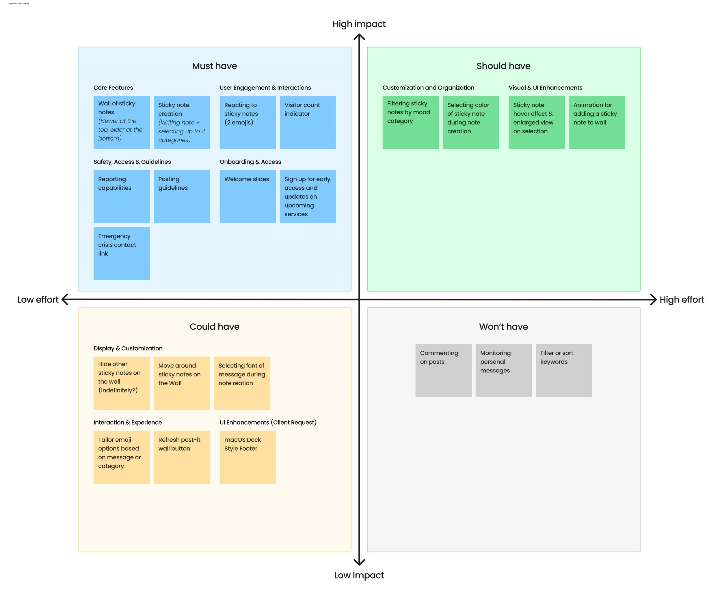
Feature prioritization matrix used to guide design decisions by impact and effort.
4. Deliver
Designing user flows, wireframes, a UI kit, and conducting usability tests.
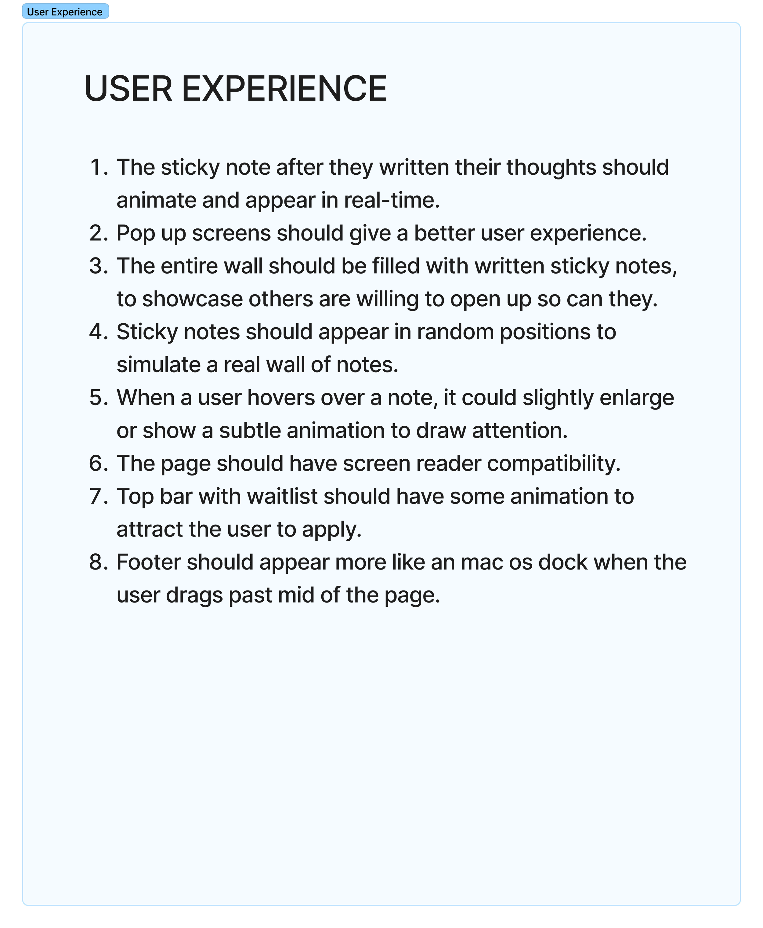
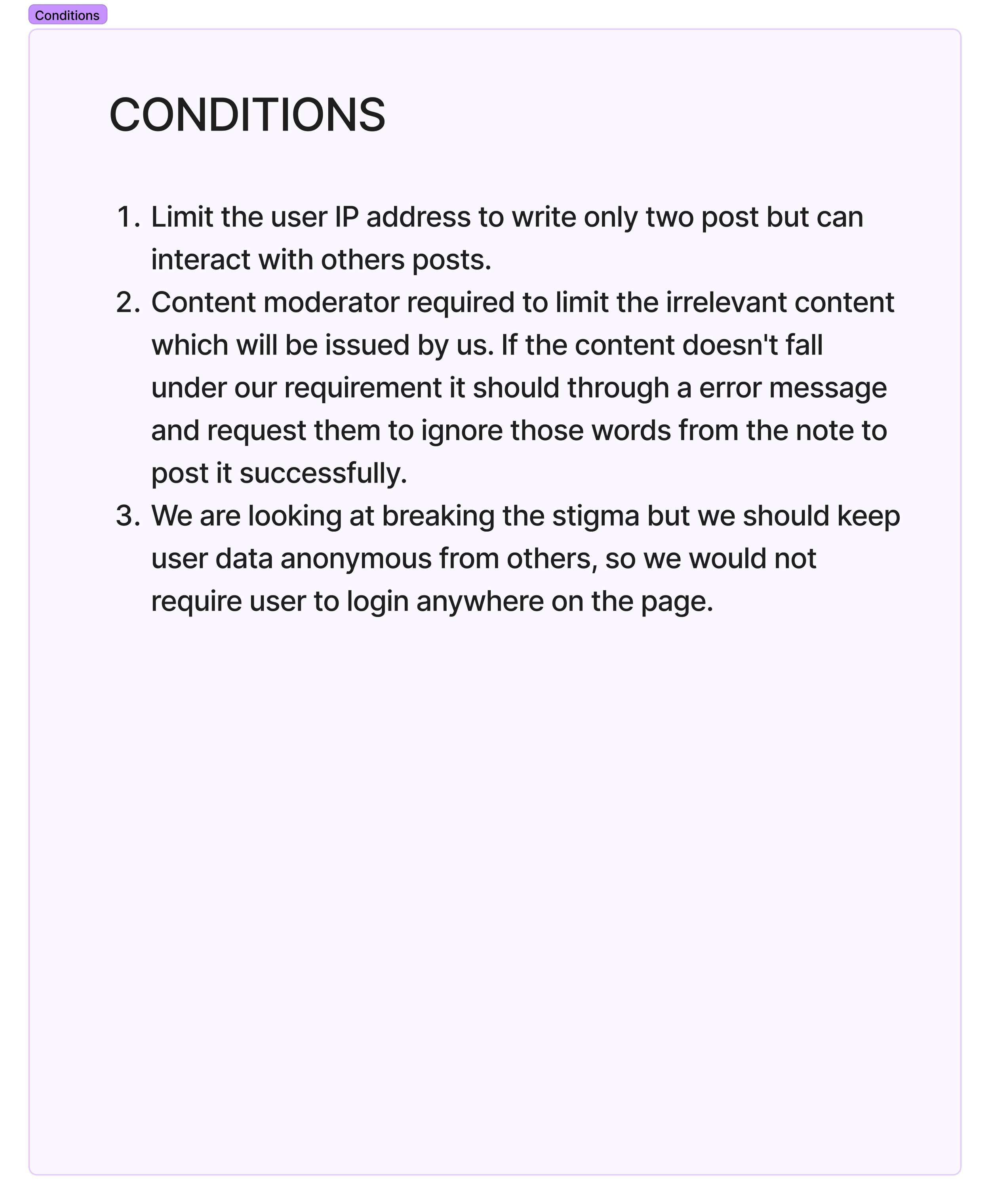
Creating User Flows
The core purpose of Gunam’s platform is to offer a safe, judgment-free space where users can express their struggles and resonate with others’ experiences. While our primary focus was designing flows for posting notes and reacting to posts, we also integrated the option to join Gunam’s waitlist within the posting flow, ensuring a seamless experience for those interested in upcoming mental health services.

User flows for posting and reacting to posts. View user flows in Figjam here.
Lo-Fidelity Digitized Wireframes
We transitioned from sketches to wireframes to bring more structure and clarity to our ideas. My partner and I divided the workload while constantly collaborating to ensure a cohesive design. We started wireframing for desktop first.
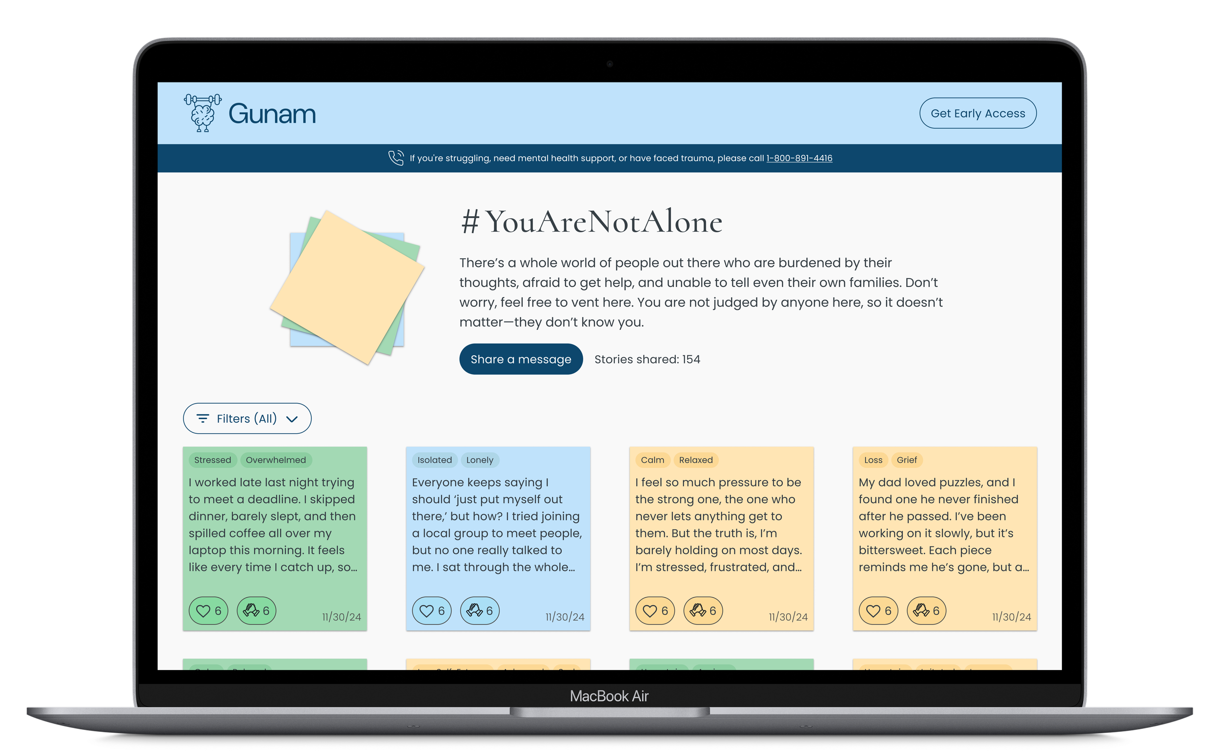
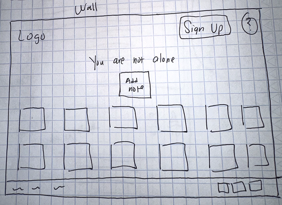
Homepage Sticky Note Wall Wireframes
We created low-fidelity desktop wireframes for the sticky note wall, where users’ anonymous posts would appear. Based on client input, we explored both scattered and grid layouts for comparison.

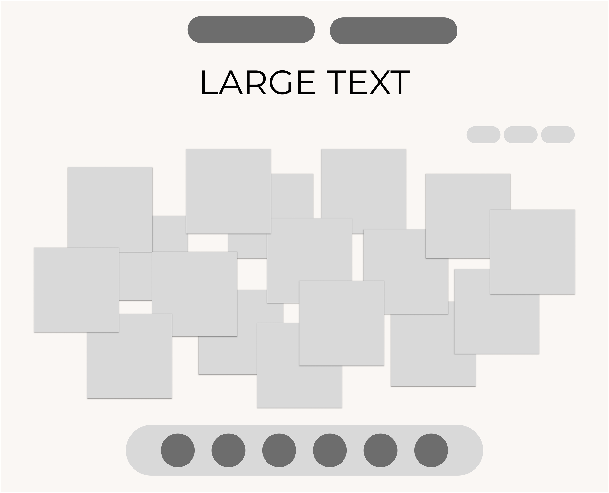
Lightly scattered desktop layout
Densely packed desktop layout
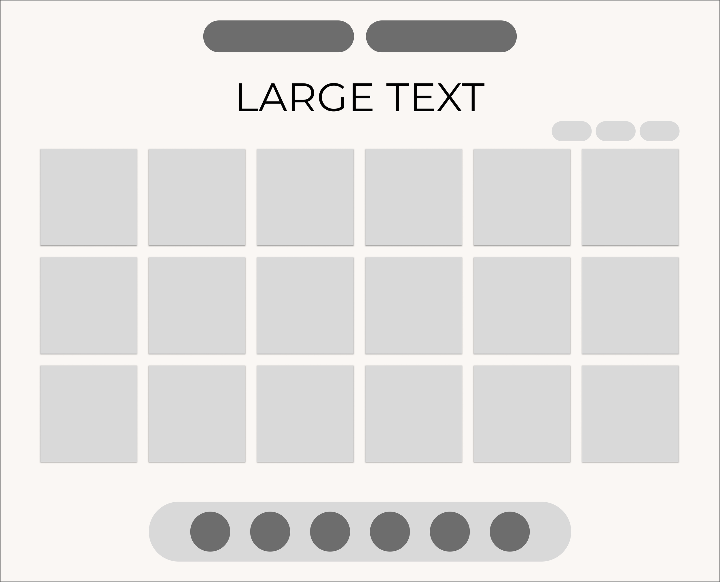
Grid dektop layout
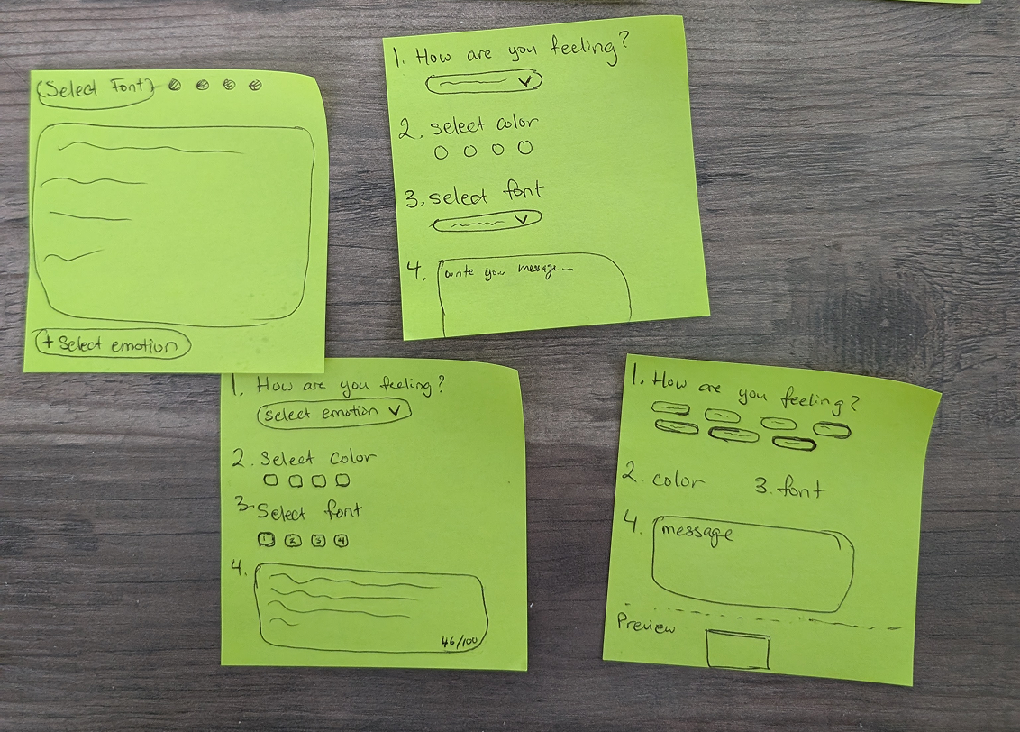
Note Creation Wireframes
In our first version, users could choose a note color and font. To streamline the experience for low-fidelity testing, we removed font selection and focused on the core flow:
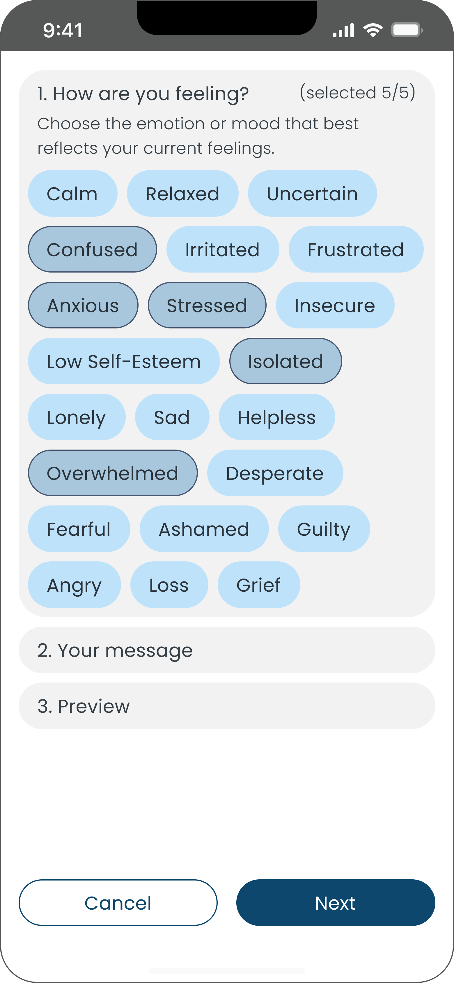
Select up to five mood categories (pre-selected by the client).
Choose a note color.
Write and preview a message.
First version with font and color selection.
Second version with simplified flow for testing.


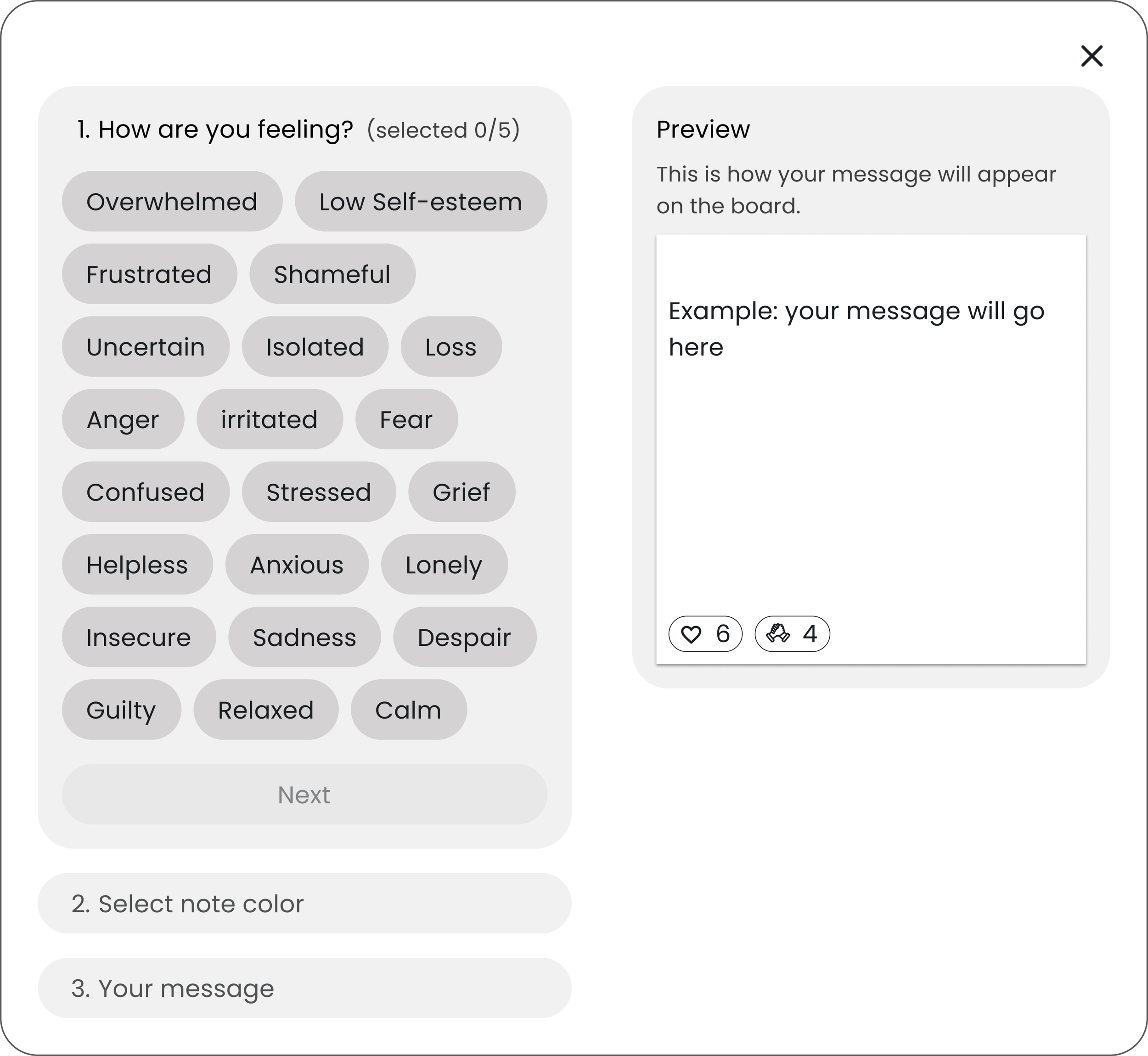

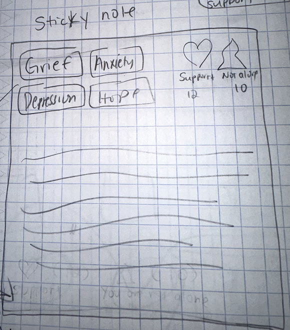
Sticky Note Wireframes
Each sticky note included up to five mood categories, a user-submitted message, two preset emoji reactions, and the date. Notes appeared on the wall after a user created a post.
Sticky note with 1 mood category.
Sticky note with 5 mood categories.
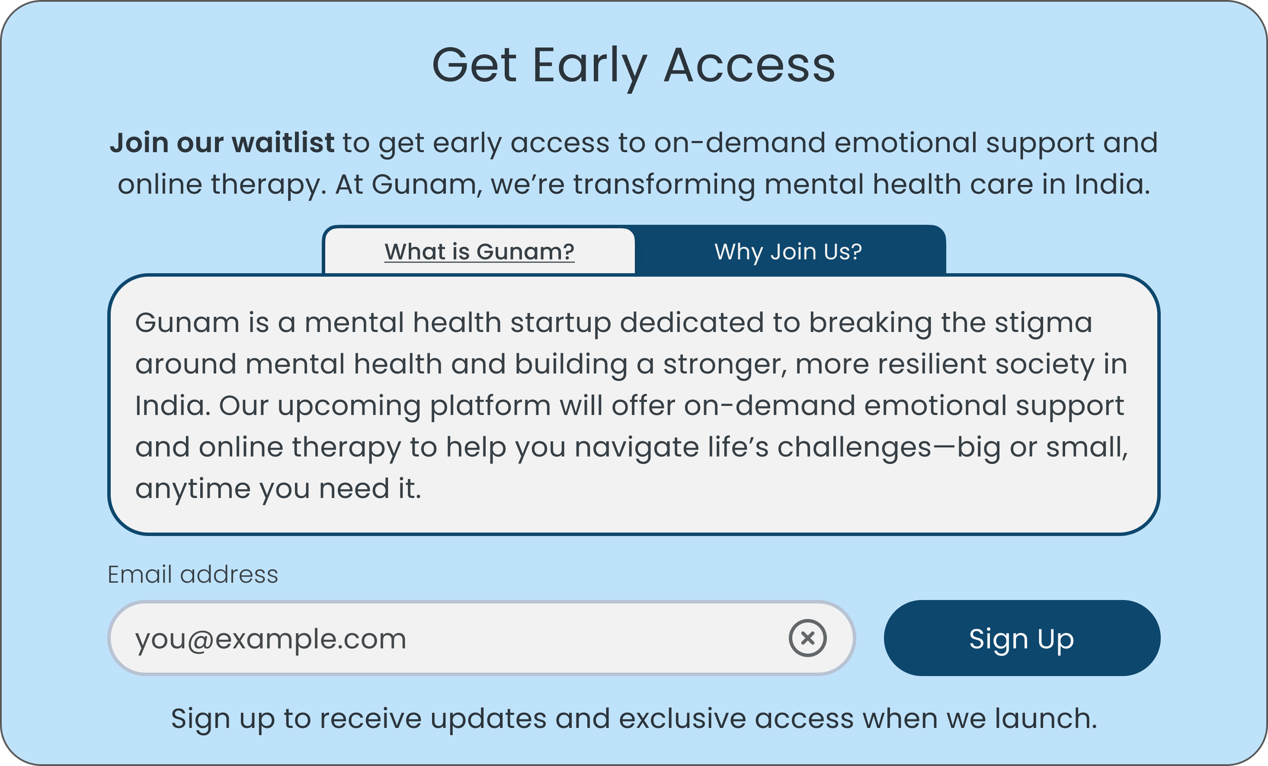
Join Waitlist Wireframe
While waiting for client details on the waitlist, we designed an early concept. We debated whether to use a separate page or an expandable section, but ultimately opted for a modal that presents key information directly next to the sign-up field and button, keeping everything in one place.

Allows users to sign up for updates on Gunam’s mental health services launch.
Challenge: We began with a desktop-first design, but after discovering that most Indian users access platforms primarily on their phones, we shifted to a mobile-first approach. The client also envisioned an infinite scroll canvas for the home screen, allowing users to scroll in all directions. Concerned about usability, we created three different home screen versions and tested them in low-fidelity sessions to gather user insights.Low Fidelity Usability Testing
We ran unmoderated low-fidelity tests with five participants (4 women, 1 man) to assess navigation and identify friction in key user flows.
1. Home Screen Feedback: Balance the tone
Findings
Some users felt the sticky note wall might become too negative and wanted to see more uplifting messages or stories.
Takeaways
Introduce ways to balance tone with uplifting content for more meaningful engagement.
2. Home Screen Layout Preferences: A/B/n Testing
We tested three home screen designs: The Wall, The Infinite Scroll Canvas, and The Map.
Findings
Most participants favored The Map for its immersive feel but believed The Wall had more potential if it was more interactive.
Takeaways
Our client noted that implementing the map design would be too demanding for the developer given their tight deadline. As a result, we shifted our focus to refining The Wall for development, prioritizing usability. Gunam’s team planned to revisit interactivity post-launch, aiming to ship before October 10 (World Mental Health Day).
1. The Wall
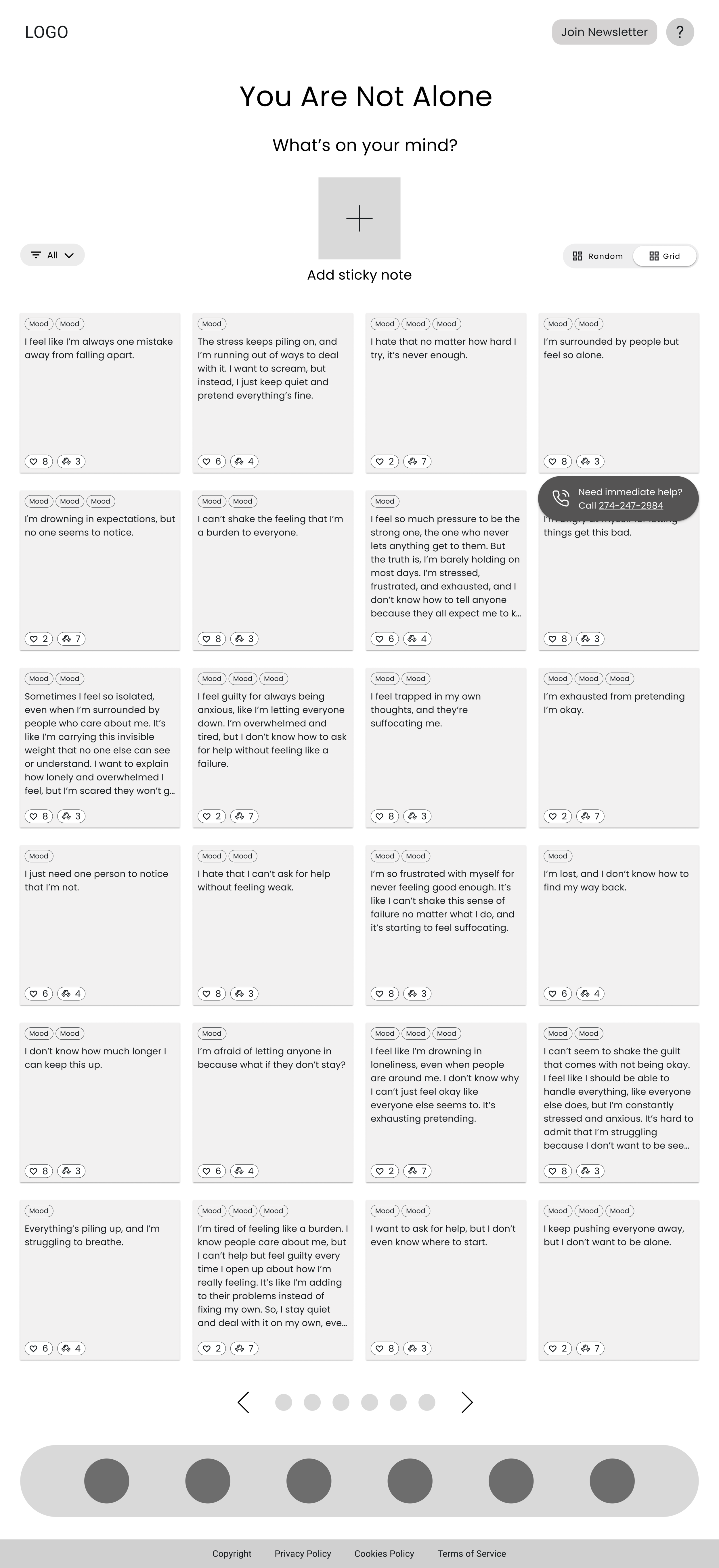
The Wall: Users were given two layout options—a 4x6 grid or a random scatter of posts across the screen. Most users gravitated toward the grid, finding it familiar and well-structured. However, some felt it was a bit "unnatural" and rigid.
2. The Infinite Canvas

The Infinite Canvas: This design allowed users to scroll 360 degrees in any direction to explore sticky notes. Although this was the client’s preferred design, almost all users found it confusing and disorganized due to the lack of hierarchy.
3. The Map
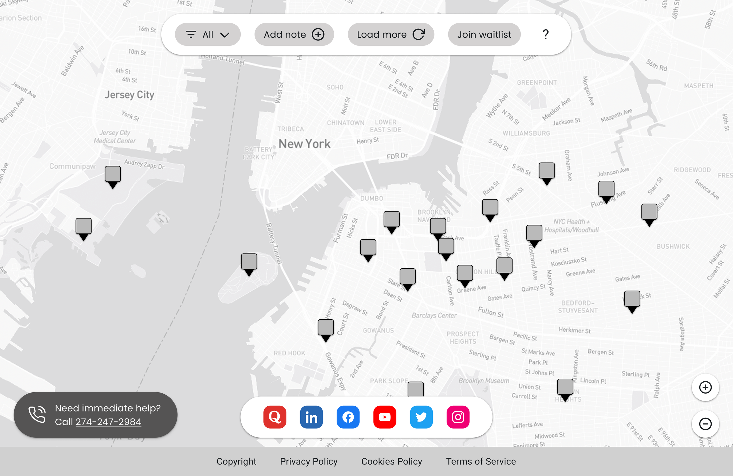
The Map: Users could drop a pin on a map, and clicking on a pin revealed a post. Many users liked the interactivity and authenticity, but dense clusters made navigation difficult. Some were also concerned about privacy.
Sticky Note Creation and Reaction Feedback
Findings
Creating: While selecting a mood category for their sticky note, some users found the number of mood selections overwhelming, while others liked having a wide variety since they could only choose five. Color selection also caused confusion. The goal was to allow users customize their note’s appearance, but many found it unclear.
Reacting: Users found it easy to leave emoji reactions, but a few wanted more variety.
Takeaways
Simplify mood options to reduce choice overload.
Reposition color selection so it feels intuitive, not like an extra step.
Creating a note low-fidelity wireframe
Sticky note created and posted on the Wall
Waitlist Sign-Up Feedback: Clarity Needed
Findings
Users were unclear whether they were signing up for a service or just a newsletter. They didn’t realize that Gunam’s mental health platform was still in development and that the sign-up was for updates and early access to participate in its launch.
Takeaways
Clarify sign-up messaging so users understand they’re joining a waitlist for updates and early access.
Joining Gunam’s waitlist low-fidelity wireframe
Real-World Constraints: Balancing User Needs with Project Scope:
Despite the insights from testing, we couldn’t implement every suggestion. The CEO chose to keep all filter options, and the short timeline prevented the developer from making the home screen as interactive as users had hoped. We prioritized delivering a minimum viable product (MVP) that addressed core functionality while leaving room for future improvements.

We reworked The Wall with illustrations that flipped to reveal inspirational quotes, adding positivity to the experience. My partner led this effort while I provided feedback. The client chose not to implement this due to tight launch timelines.
Key Learning
This testing phase reinforced the importance of constant validation. Some assumptions seemed obvious until they weren’t. Validating early designs with users helped us avoid building features that didn’t resonate. While we couldn’t implement every change, each insight refined the experience for the MVP.
Style Guide
This style guide creates a space where users like Heather feel safe, seen, and supported. Deep blue, the platform’s primary color, provides a solid and protective foundation. Light sky blue, used as the secondary color, adds a sense of openness and warmth. Together, they create visual contrast while supporting a calming emotional tone.
The type system pairs a serif headline with sans-serif body text to balance comfort with credibility, making the platform feel both personal and professional.

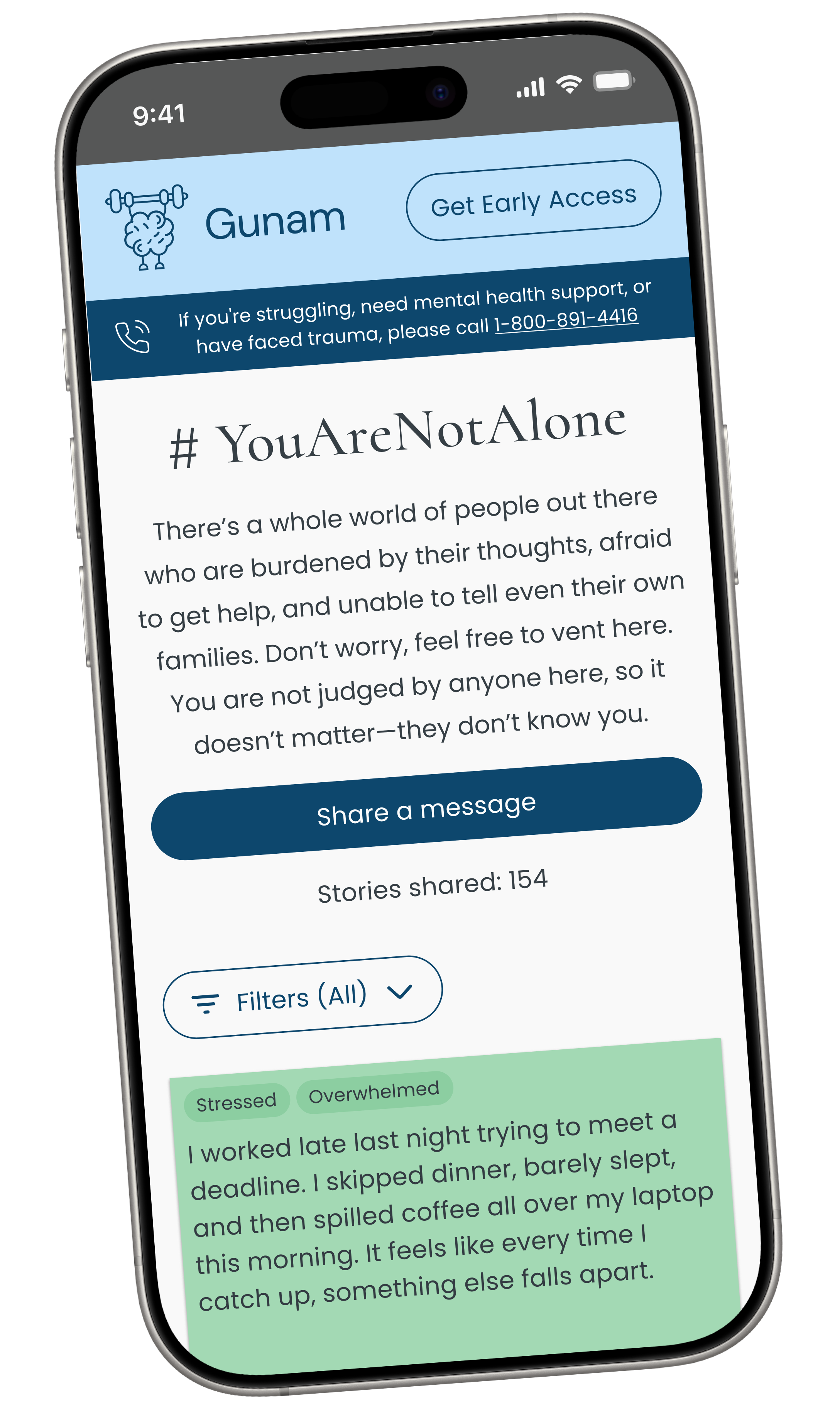
Initial High Fidelity Wireframes (Mobile-First)
After synthesizing user feedback, we translated our low-fidelity concepts into high-fidelity mockups. While early explorations focused on desktop, we prioritized mobile-first layouts to reflect user behavior. The desktop version followed.
These high-fidelity screens reflect my early UI design skills at the time. Since completing this project, I’ve been actively improving my visual design practice, with a focus on color, hierarchy, and spacing. I plan to refine these screens so they better reflect my current focus on visual clarity, cohesion, and accessibility.
Welcome screens

Home screens


Introductory flow

Images of the home screen as users scroll down page
Note creation


From left to right: Note creation flow
Sign-up section

Sign-up at bottom of home screen
Expanded note for reporting
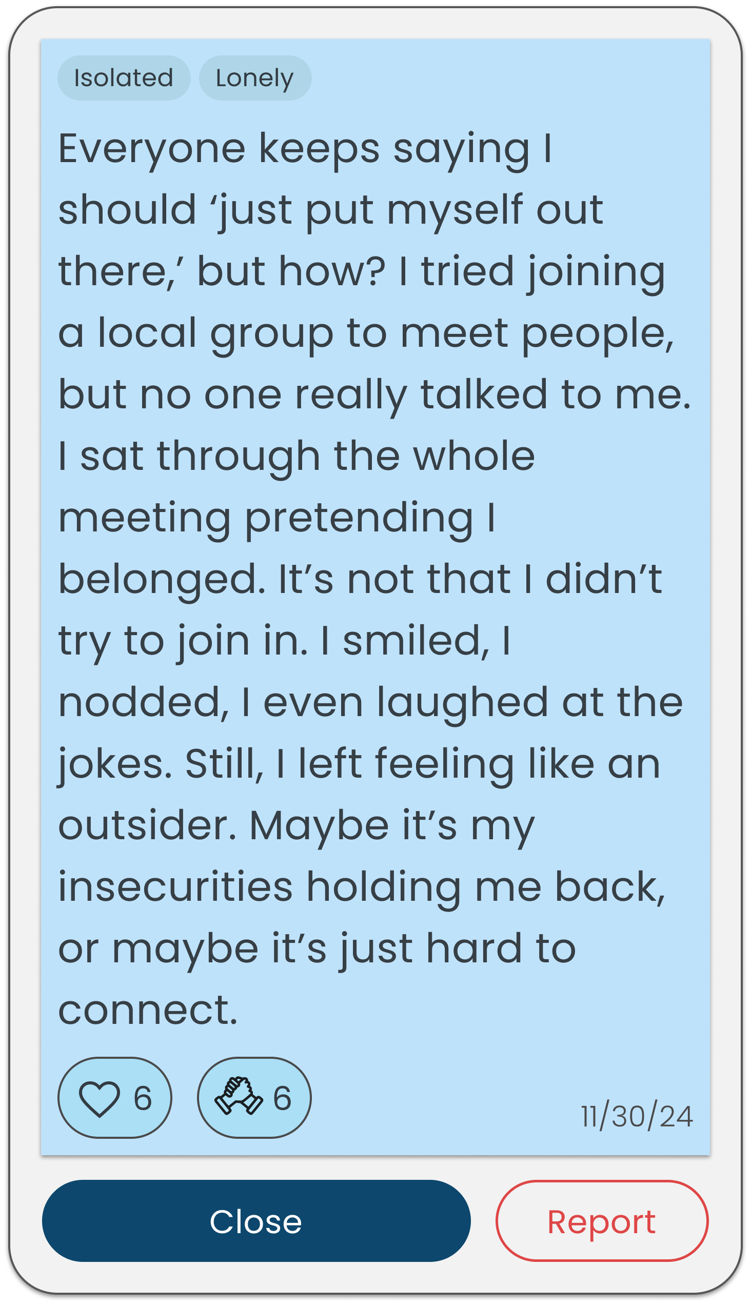

Enlarged note revealing reporting
Hi-fidelity Usability Testing
Due to time constraints, we were unable to conduct high-fidelity usability testing before delivering the product to our client. After delivering the MVP, we took the initiative to conduct high-fidelity testing to identify any final refinements and usability improvements with five female participants.
The client also planned to run their own user testing with participants in India once the site was live in time for World Mental Health Day.
Iterations from Usability Tests
1. Changes to the Home Screen
Condensing grid layout
The homepage was clear and easy to navigate, but 2 out of 5 users felt slightly overwhelmed by the 4x5 grid layout . To balance readability with emotional comfort for users navigating mental health struggles, we switched to a 4x4 grid, offering a more digestible number of notes while maintaining engagement.
Other Style Changes
Brightened the secondary blue to feel more inviting.
Updated the "YouAreNotAlone" header font to add warmth and welcome.
Added a floating action button for quick access to note creation while scrolling.

Before
After

Homepage updated based on user feedback
Original homepage layout
Sign-up: Further Clarifying Expectations
One user found the "Join Waitlist" header misleading, thinking services were already available.
Although the client preferred the original title, we updated it to "Get Early Access" to better reflect the site’s timeline.

Before
After
Original sign-up section
Sign-up section updated for clarity
Simplifying Note Creation Steps
To streamline the flow, we removed the “Personalize Your Note Color” step and placed the color options below the message preview, reducing friction for users eager to write.

Before
After

Color selection appeared as a separate step
Updated layout places color below preview for faster posting
Final Design and Prototype
These mobile and desktop prototypes reflect our initial high-fidelity direction. While the UX structure aligned with user feedback, I’ve since identified opportunities to improve the visual design system. A visual refresh is part of my next steps.
Outcomes
In the first 2 months, over 20,000 users in India have engaged with the YouAreNotAlone platform, finding validation and support within an anonymous community.
In 4 weeks, we designed a responsive mental health platorm where users could share thoughts anonymously, react with emojis, and sign up for updates on Gunam’s future mental health services.
User interviews revealed key needs: a secure, anonymous space, reassurance that users weren’t alone, and easy access to support. We defined the problem through affinity mapping and personas, iterated from low- to high-fidelity prototypes, and refined the design through A/B/n and usability testing.
Reflection
Cultural Context Matters
Since our users were based in India but we only interviewed participants in the U.S., we missed important cultural nuances around mental health stigma. This experience reminded me how critical it is to understand the user’s context, especially when designing for sensitive topics.
Designing with Care and Empathy
Working on a mental health platform also reinforced the importance of designing with care. Every word, tone choice, and interface element needed to support emotional safety and trust.
Next Steps: Visual Design Enhancements
Reflecting on this project, I recognize that while the UX process was strong, the visual design could be further refined. Since completing this work, I’ve been actively studying UI principles, focusing on color, spacing, and typography, to strengthen my visual design skills.
My next steps include
Revisiting this project to improve its visual polish and accessibility.
Ensuring the interface is as supportive and engaging as the experience itself.
More case studies