
Case Study
A Responsive Web Design for a Local Hair Stylist
Hair by Heather: A visual identity and responsive system that helps a seasoned stylist showcase her work and connect with new clients.


Team
Samaria Berry, Heather Smith (client)
Timeline
4 weeks
Tools
Figma, Figjam, Whimsical, Midjourney, Zoom
Role
UX/UI Designer, Researcher, Content Writer
Overview
Hair by Heather is a responsive website for Heather Smith, a hair stylist specializing in color at Salon One 50 in Alamo, California. With over 35 years of experience, she needed a digital presence to attract new clients, showcase her vibrant portfolio and services, and make it easy for people to get in touch. The site highlights her warm personality and provides an online presence, making it easier to maintain and grow her clientele if she changes salons in the future.
Challenge
When I reached out to Heather, she had little online presence and relied primarily on word of mouth for new clients. After the COVID-19 pandemic slowed her business, she needed a way to display her expertise, reach a broader audience, and maintain her preferred booking method (texting) while still offering alternative contact options.
Impact
The final design is a modern, mobile-first website that reflects Heather’s unique style and values. The platform clearly presents her services, builds trust with visitors, and supports easy communication. Heather is currently working on getting the site developed to launch it soon.
Jamie wants to feel confident reaching out to a new hair stylist who gets her style, shows clear pricing, and feels trustworthy.

HMW: How might we present Heather’s services, skills, and personality in a way that builds trust, showcases her work, and helps new clients like Jamie feel comfortable reaching out?
1. Discover
Researching what salon-goers value when looking for a hair stylist.
Aligning on Goals
Before jumping into design, the project kicked off with a conversation to understand Heather’s needs and priorities. Two goals emerged:
1. Showcase Heather’s work in a professional, visually engaging way.

2. Make it easy for new clients to understand services and reach out.

Competitive Analysis
To understand what potential clients might expect, I analyzed four websites: two salon brands and two individual stylist sites. The review shaped our user interview questions and surfaced features to explore further.

Competitive analysis matrix comparing four salon websites.
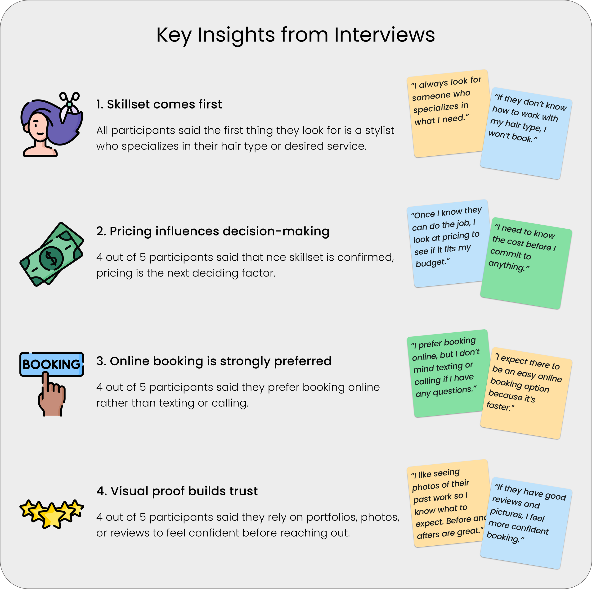
Conducting User Interview
Over a week, I interviewed five frequent and casual salon-goers over Zoom to understand what influences their decision to reach out to a hair stylist.

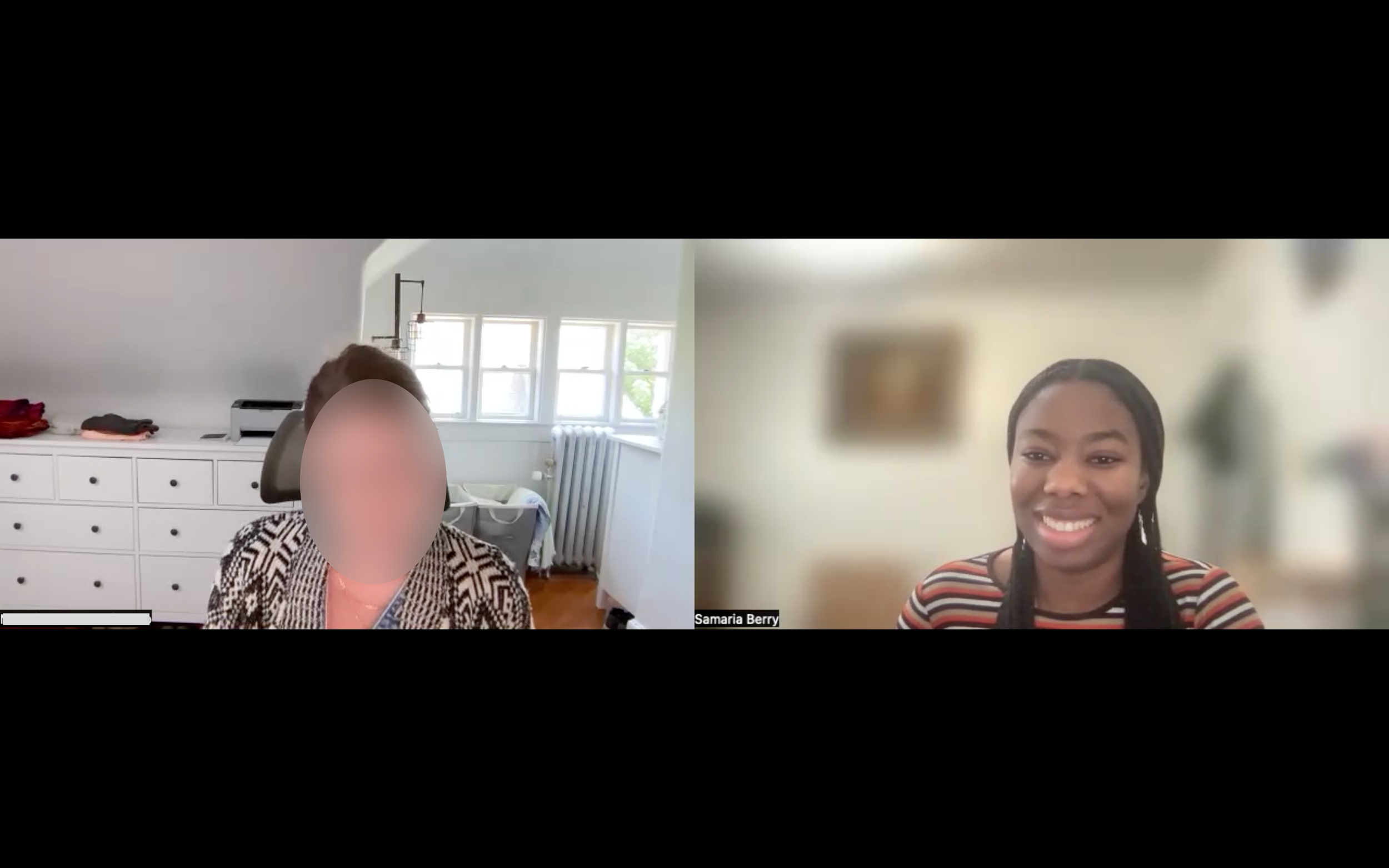
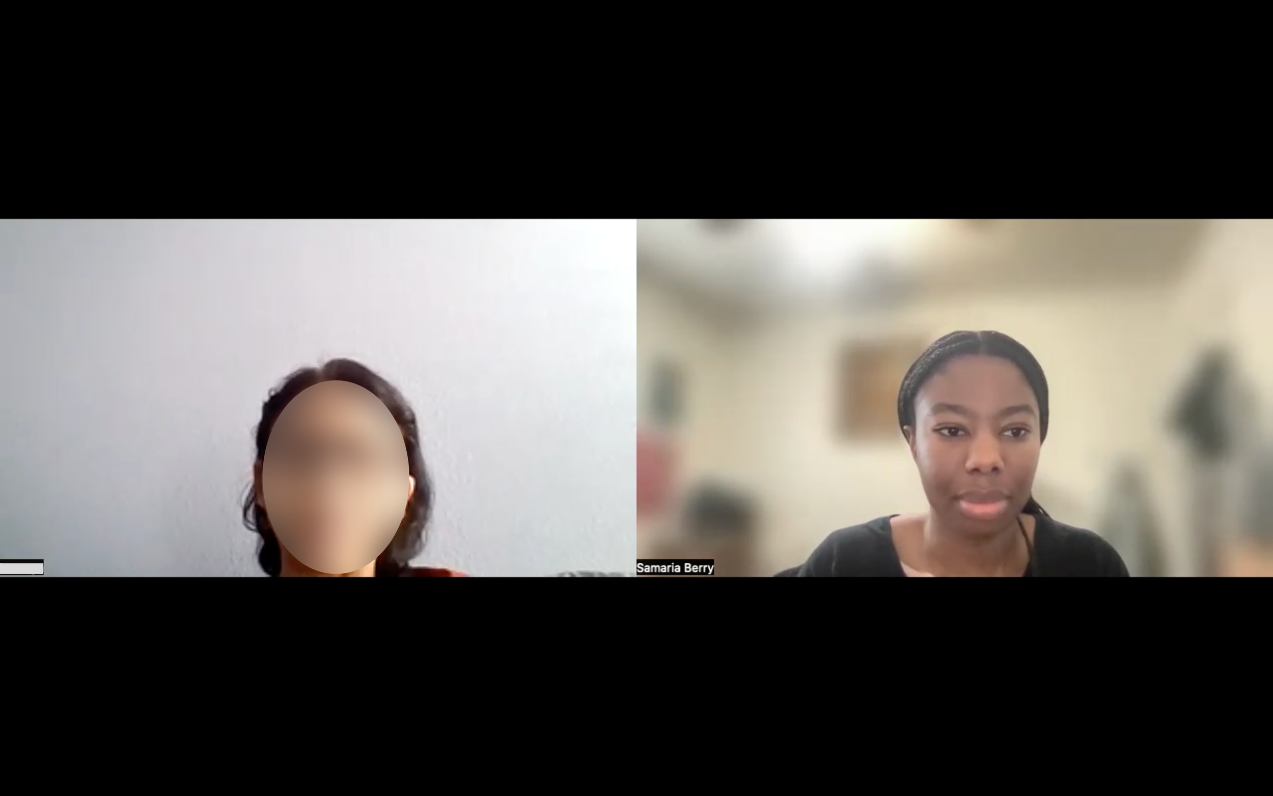
Screenshots of Zoom user interviews to gather insights.
Key Findings
Visuals and reviews helped users evaluate the stylist’s skill and build trust.
Bio, location, and contact info helped users assess personal fit and convenience.
Most preferred a quick, easy online booking process.
2. Define
Synthesizing feedback to create a clear design strategy.
Connecting the Dots with Affinity Mapping
After the user interviews, responses were grouped into themes using affinity mapping. From there, content priorities became clear: lead with visuals, keep pricing transparent, and provide flexible ways to contact Heather.
Key themes synthesized from affinity maps, based on user interview insights. View full affinity map here.
User Persona: Jamie, the Creative Color-Seeker:
To humanize the data, a user persona was created: Jamie, a creative professional who loves expressive hair but values trust and clarity. Designing with Jamie in mind helped ensure I met the needs of real salon-goers like her.
The goal: Help users feel confident enough to contact Heather, return, and refer others.

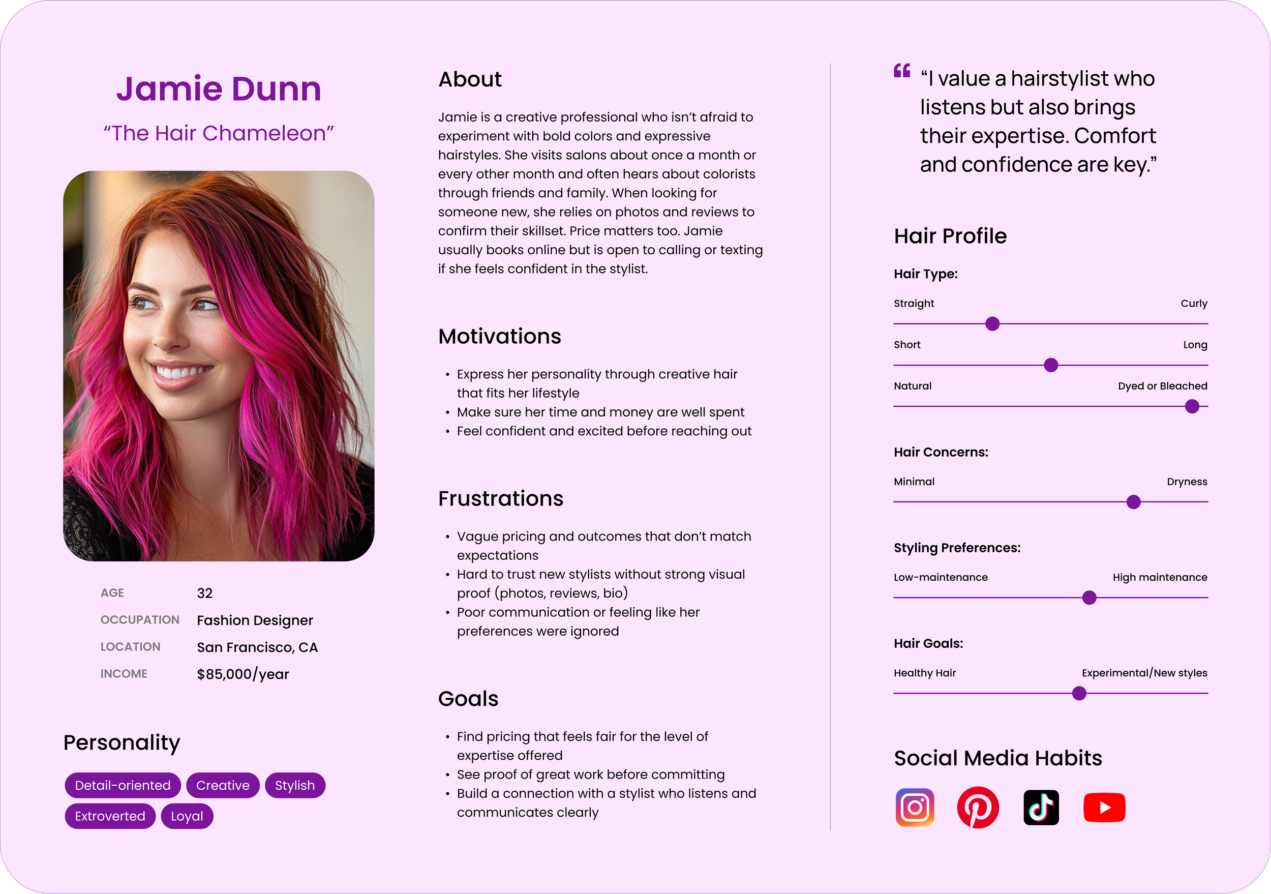
User persona based on interview insights, featuring an AI-generated image from Midjourney.
Balancing Client Constraints

While Heather prefers to book by text and isn’t currently active on social media, I explained that research showed users expect to book online and view stylists’ work on Instagram. The current design prioritizes clarity and ease of use to match Heather’s habits without adding unnecessary complexity. At the same time, the layout leaves room for future upgrades like online booking and social media integration when Heather is ready.
3. Develop
Prioritizing features and sketching Heather’s key pages.
Prioritizing What Matters Most
With goals and personas in place, a feature prioritization matrix helped focus on features that would deliver the most value.

Feature prioritization matrix used to guide design decisions by impact and effort.
Sketching Early Ideas
Initial layouts focused on the homepage, services, and gallery, three areas that users said mattered most. I shared early sketches with Heather, my mentor, and peers to get early feedback before moving into wireframing.


Services page sketched exploring layouts.

Hair gallery page exploring layouts.
4. Deliver
Bringing the site to life from user flows to high-fidelity design and testing.
Mapping the Experience
Once features and layout ideas were sketched out, user flows illustrated how visitors would move through the site and what actions they’d want to take. A sitemap translated those flows into a clear content structure.
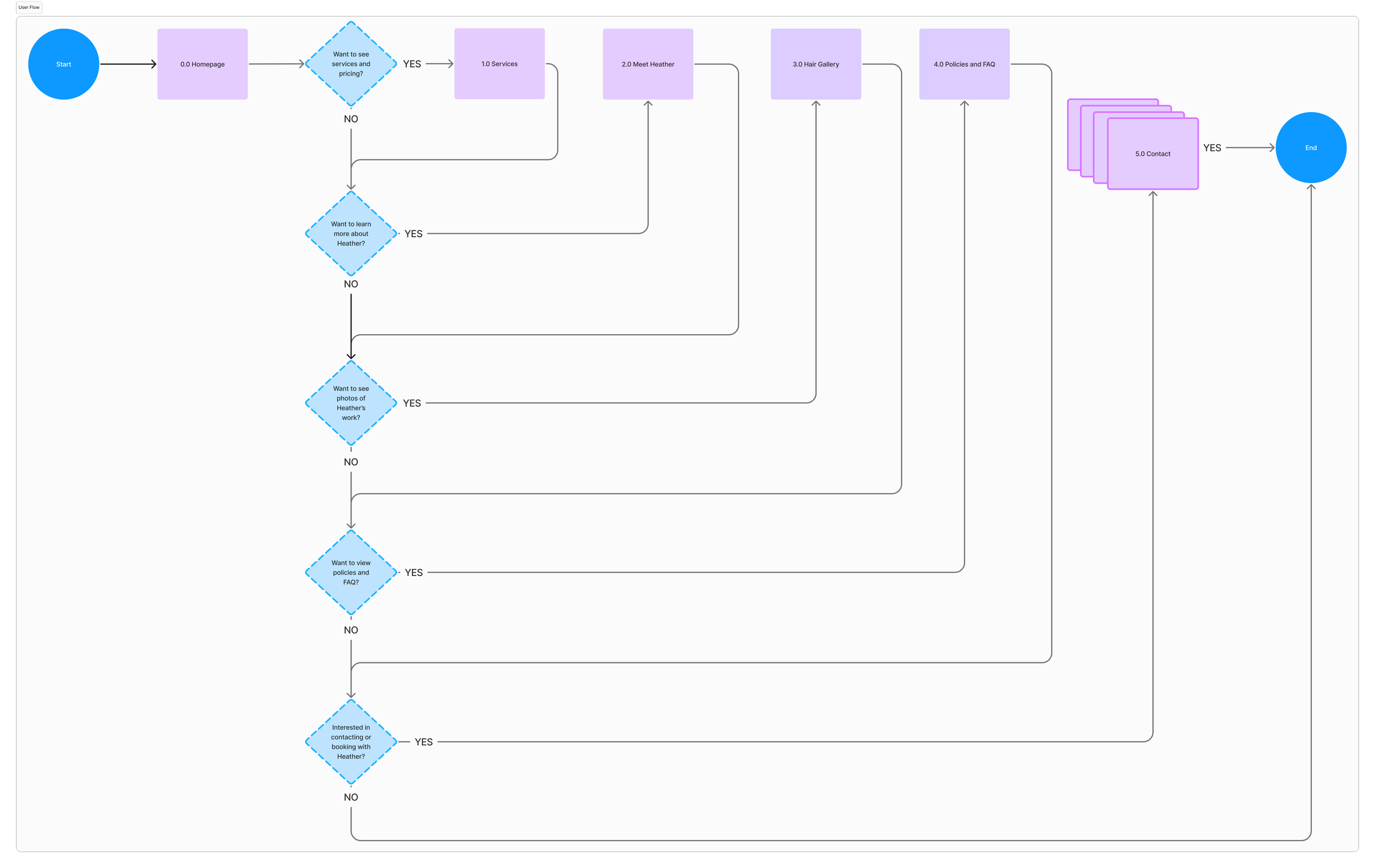
A user flow diagram illustrating how visitors navigate to key page.

Sitemap of the main pages.
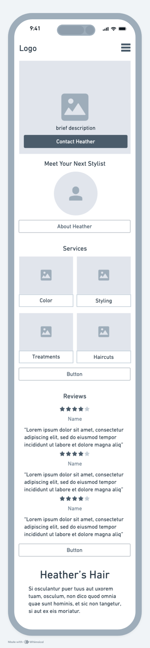
Wireframing with a Mobile-First Mindset
Given that Heather uses her phone to manage appointments, the design process began with mobile wireframes. Whimsical made it easy to explore different layouts quickly, though later rebuilding everything in Figma proved time-consuming.
Homepage
Services Page

Hair Gallery Page
Contact Page

Low-fidelity mobile wireframes made in Whimsical.
Validating with Real Users
Low-fidelity wireframes were tested with the original interview participants. They reviewed the homepage, services, hair gallery, about, and contact layouts.
Homepage feedback:
Users wanted the services section higher and suggested adding a mini gallery.

Original wireframe of homepage.
Services Page feedback:
Participants preferred having a button after each section, which made it easier to take action right away without searching for a contact option.
Some users suggested collapsible sections or filters to avoid scrolling, but most felt the layout worked well as long as it stayed clean with enough white space.
CTA’s under each service section.
No CTA’s under each service section.
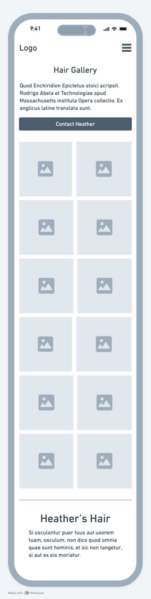
Hair Gallery Page Feedback
The 2x5 grid layout was preferred over a masonry grid.
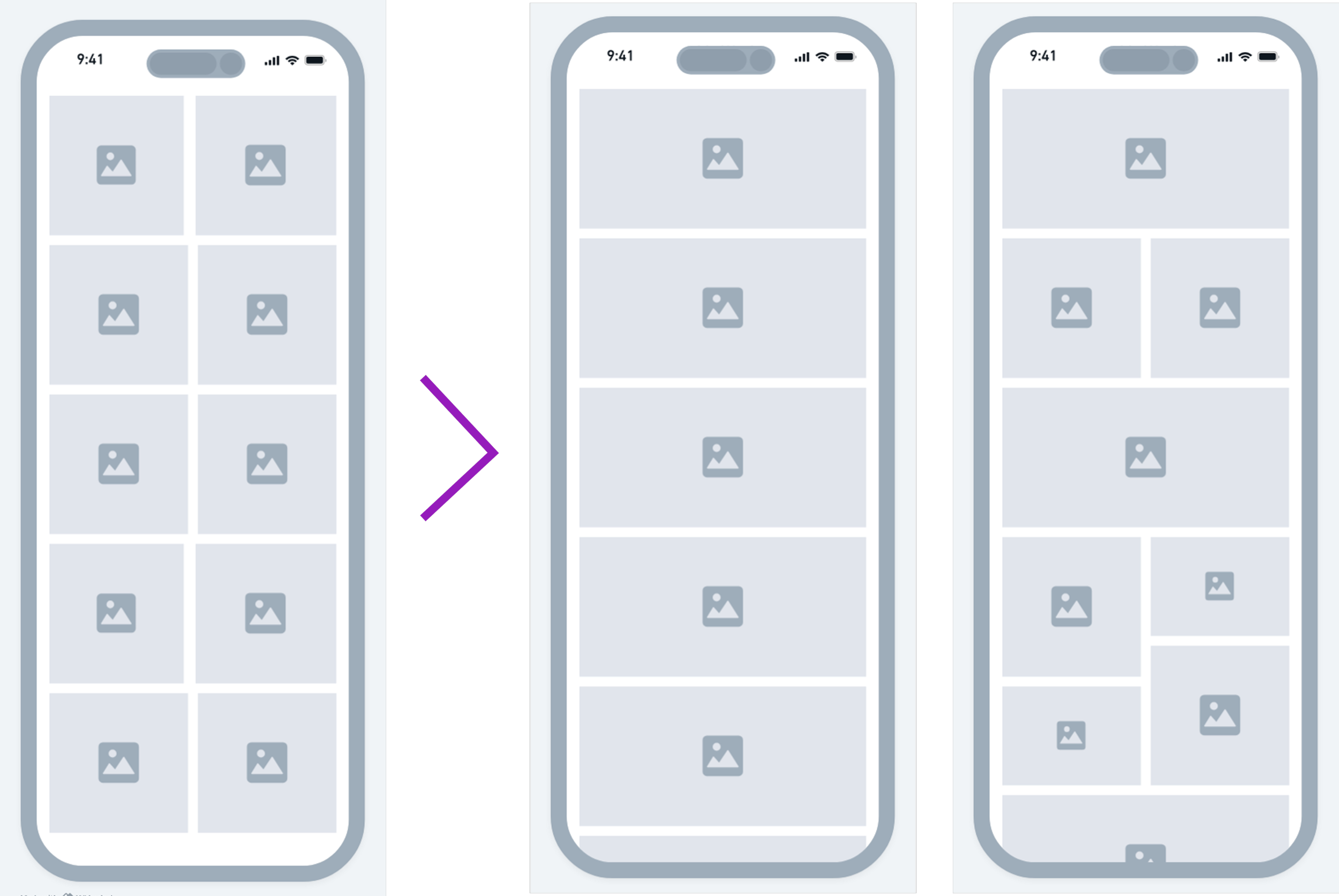
Left: 2x5 photo grid. Middle: Full-width image layout. Right: Masonry grid layout.
Contact Page Feedback
Users suggested adding an option to select a specific service and upload images for inspiration.

Original wireframe of Contact page.
Key takeaways:
Thanks to early user insights, I uncovered overlooked details such as adding a visual gallery to the homepage and allowing users to upload inspirational photos on the contact form. These improvements enhanced both function and user experience and highlighted the importance of early user feedback.
Making the Brand Match Heather’s Creative Style
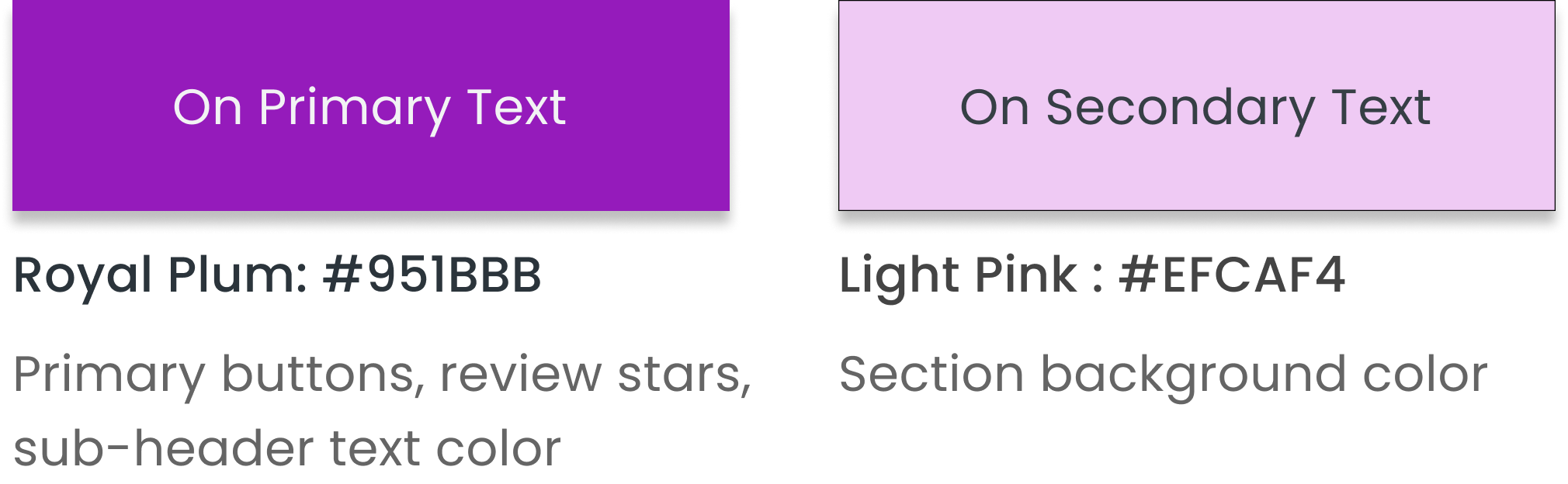
Color Palette That Reflects Heather’s Style
Heather gave me full creative control, so I chose purple as the primary color to highlight her creativity. Light pink as a secondary color adds a softer, more welcoming tone that balances the color scheme.
Elegance in a Logo
The “Hair by Heather” wordmark uses Montaga, chosen for its elegance, readability, and strong presence as a display font.

Type That Balances Personality and Clarity
The elegant serif Montaga brings character to headers and the logo, while Work Sans keeps body text clean and easy to read.

High-Fidelity Design: Polishing the Experience
Homepage
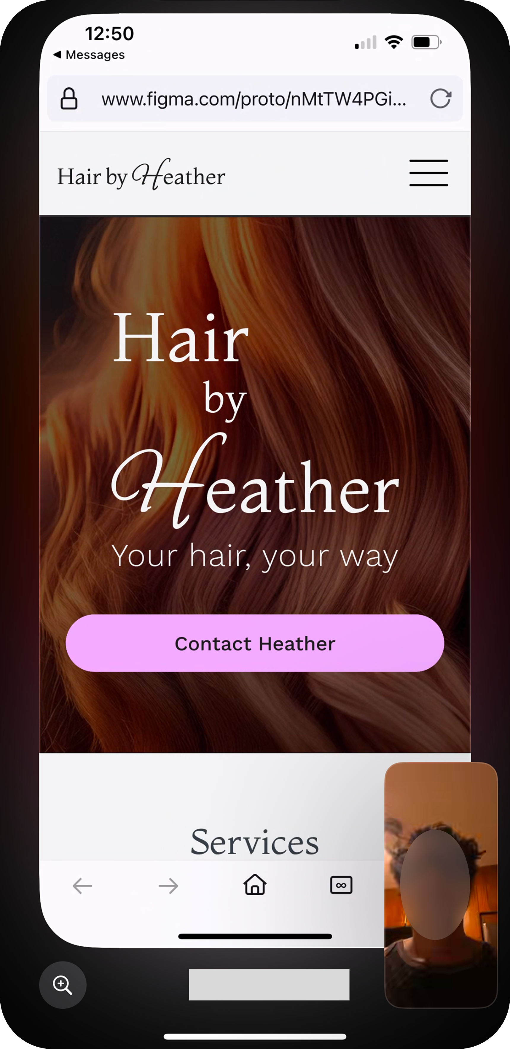
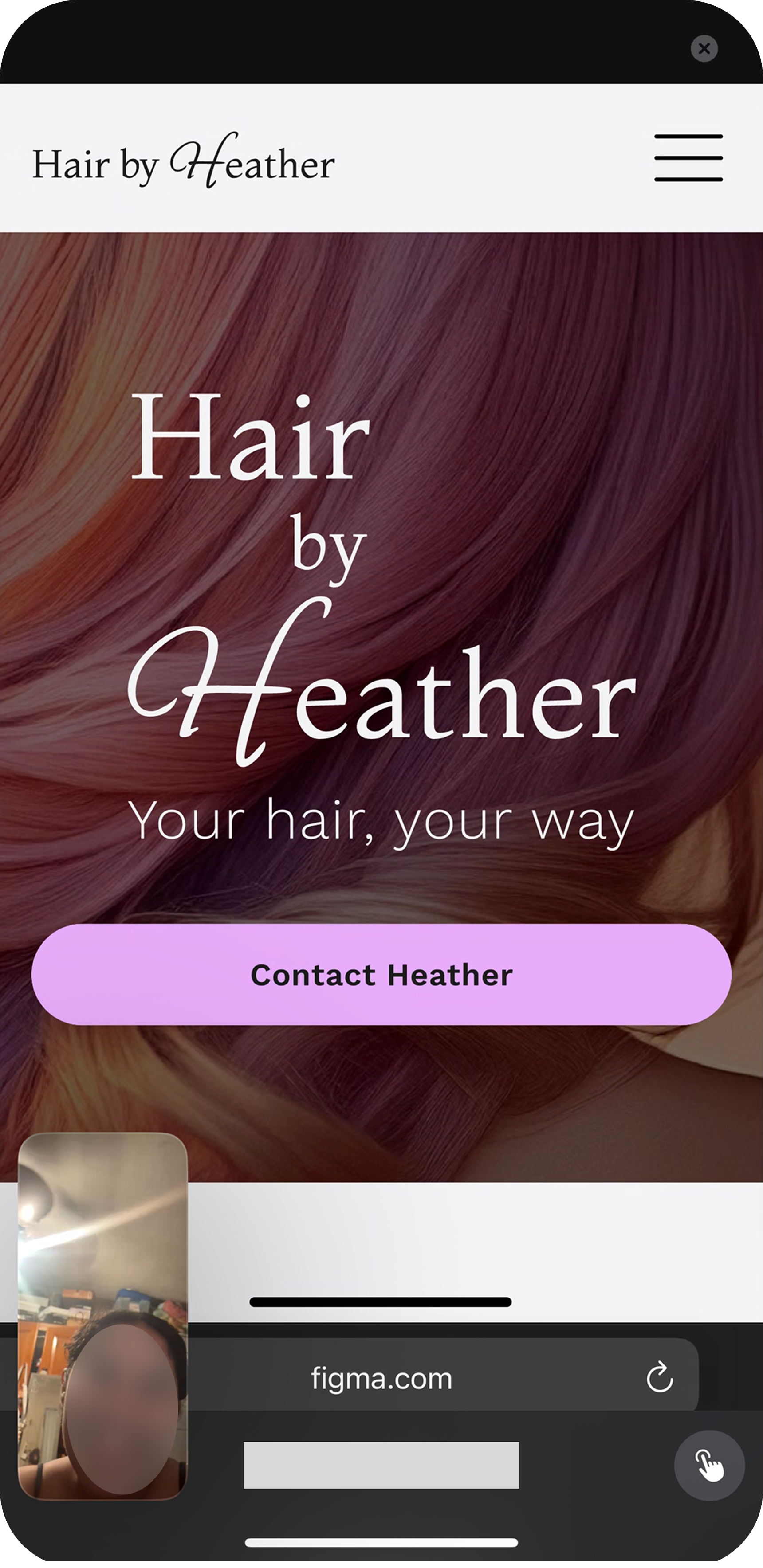
The homepage includes a hero carousel, quick service preview, a mini hair gallery, a Meet Heather section, client reviews, and a location map. The goal: give users just enough to build trust and encourage further exploration.
Short video of homepage.
Services Page:
Large header images and well-organized sections guide visitors through Heather’s offerings. Each service includes a price, time estimate, and short description, along with a “Contact Heather” button to encourage action.
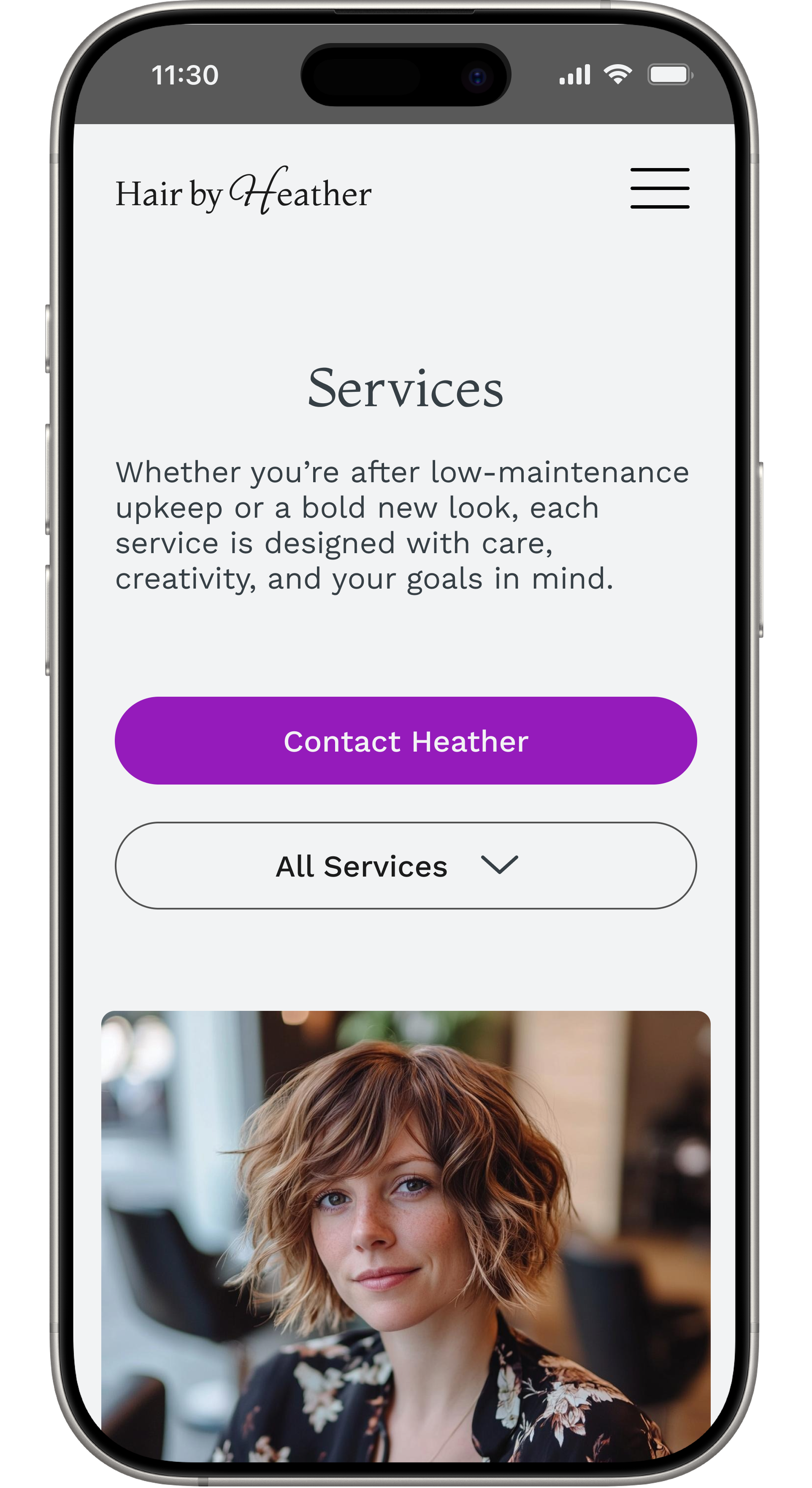

Top of services page.
Scroll-down view with CTAs.
Meet Heather
This page highlights Heather’s experience, color specialties, and location, all key details users and early testers looked for to build trust.


Top of hair gallery page.
Scroll-down view.
Hair Gallery Page:
Photos are displayed in a clean 2x5 grid. Clicking an image opens a larger view with a call to action, helping turn inspiration into conversion.
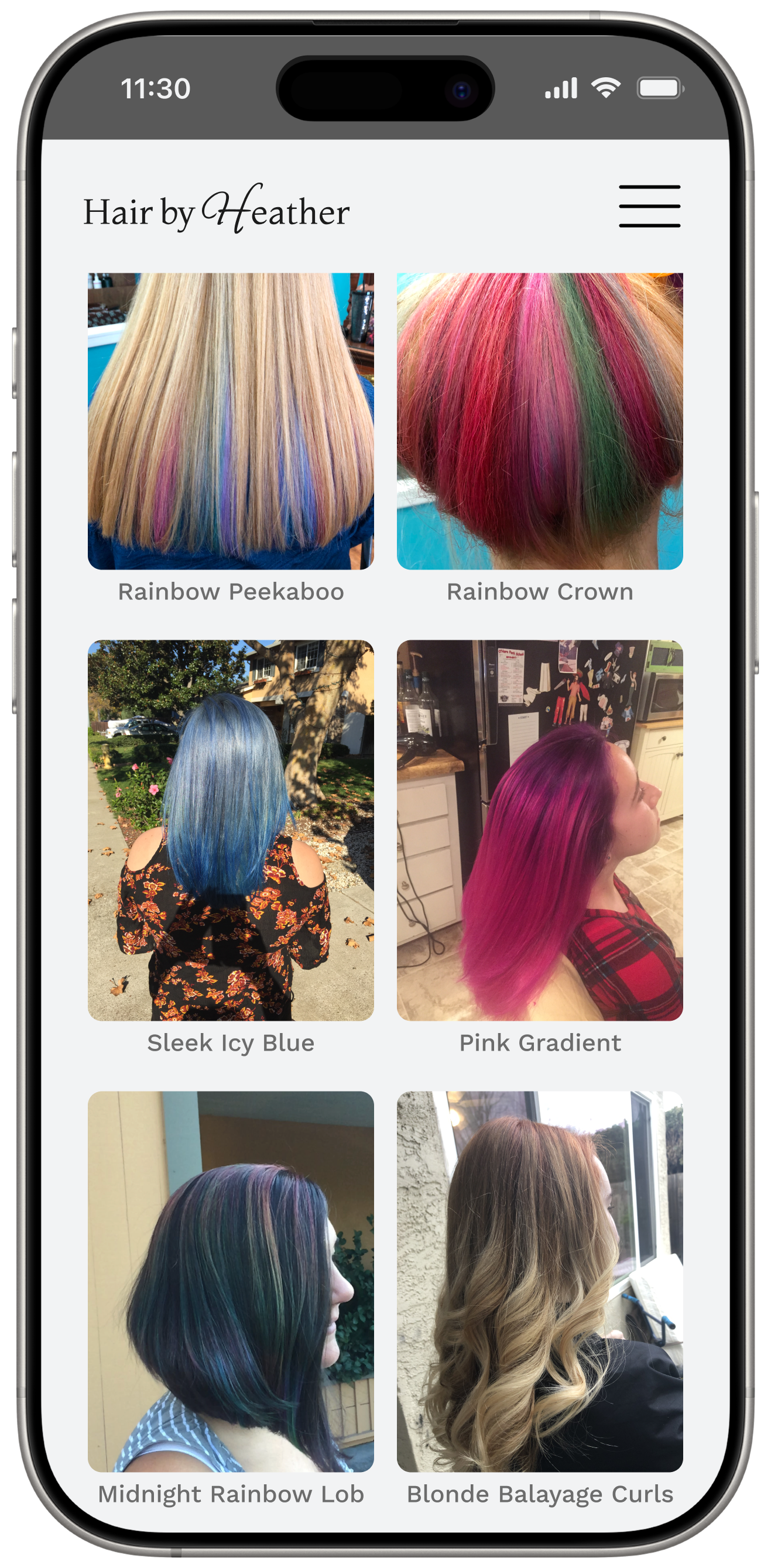
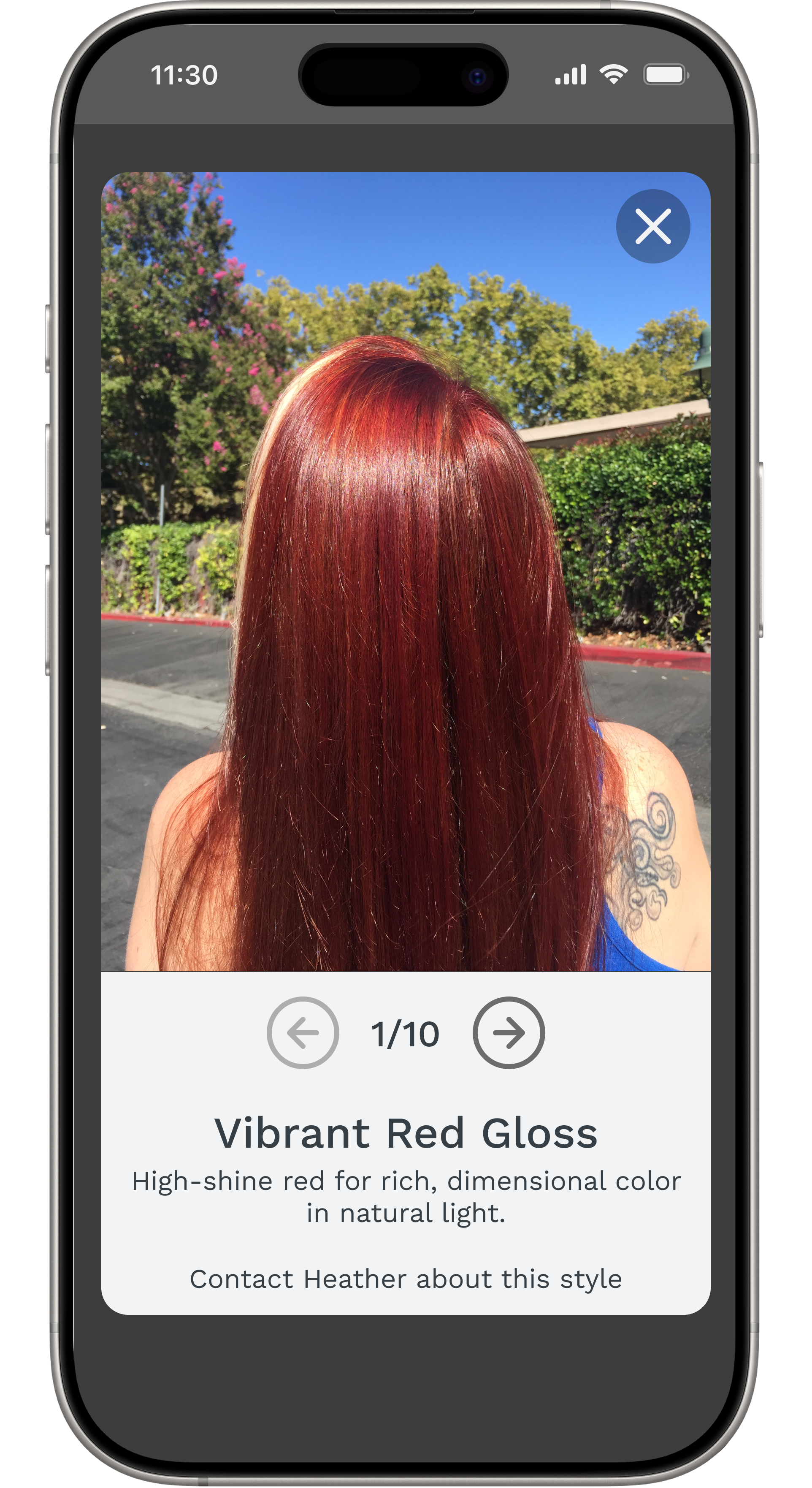
Grid view.
Enlarged photo.
Contact Page
Heather prefers texting, and the design makes that clear. At the same time, the contact form offers a more traditional option for users who may feel hesitant to reach out initially by text or phone, as revealed in early interviews.
Short video of Contact page flow.
Final User Testing: Did It Work?
Once high-fidelity prototypes were complete, I tested them again with the same five salon-goers.
Remote usability tests conducted on users’ mobile devices.
What users liked:
Project Goals Achieved: Overall, all participants rated the site a 4.5 out of 5 for ease of use.
All users said the site was intuitive, well-organized, professional and welcoming.
5/5 felt they had enough information from the website to reach out and potentially book.
User Communication Preferences Confirmed Through Research
4/5 preferred using the form over texting or calling due to convenience or personal preference.
2/5 specifically said they would avoid calling and appreciated having multiple options.
Final Iterations Based on Testing
Spacing & Layout
Testing feedback: 4/5 users felt that the layout needed more white space between and within sections to improve readability and visual flow.
Iterations: Increased padding and line height for better readability.
Typography Consistency:
Testing feedback: One user suggested streamlining the use of colors and font weights, noting that there were too many variations that made the site feel slightly disjointed.
Iterations: Streamlined fonts and button styles for a more cohesive look.

Homepage iterations: color, spacing, and typography
Adding Subheaders to the Meet Heather Page
Testing feedback: One user recommended adding subheaders to the “Meet Heather” section to break up the content and improve scannability (Another user agreed when asked in a following user interview).
Iterations: Added subheaders for better readability.
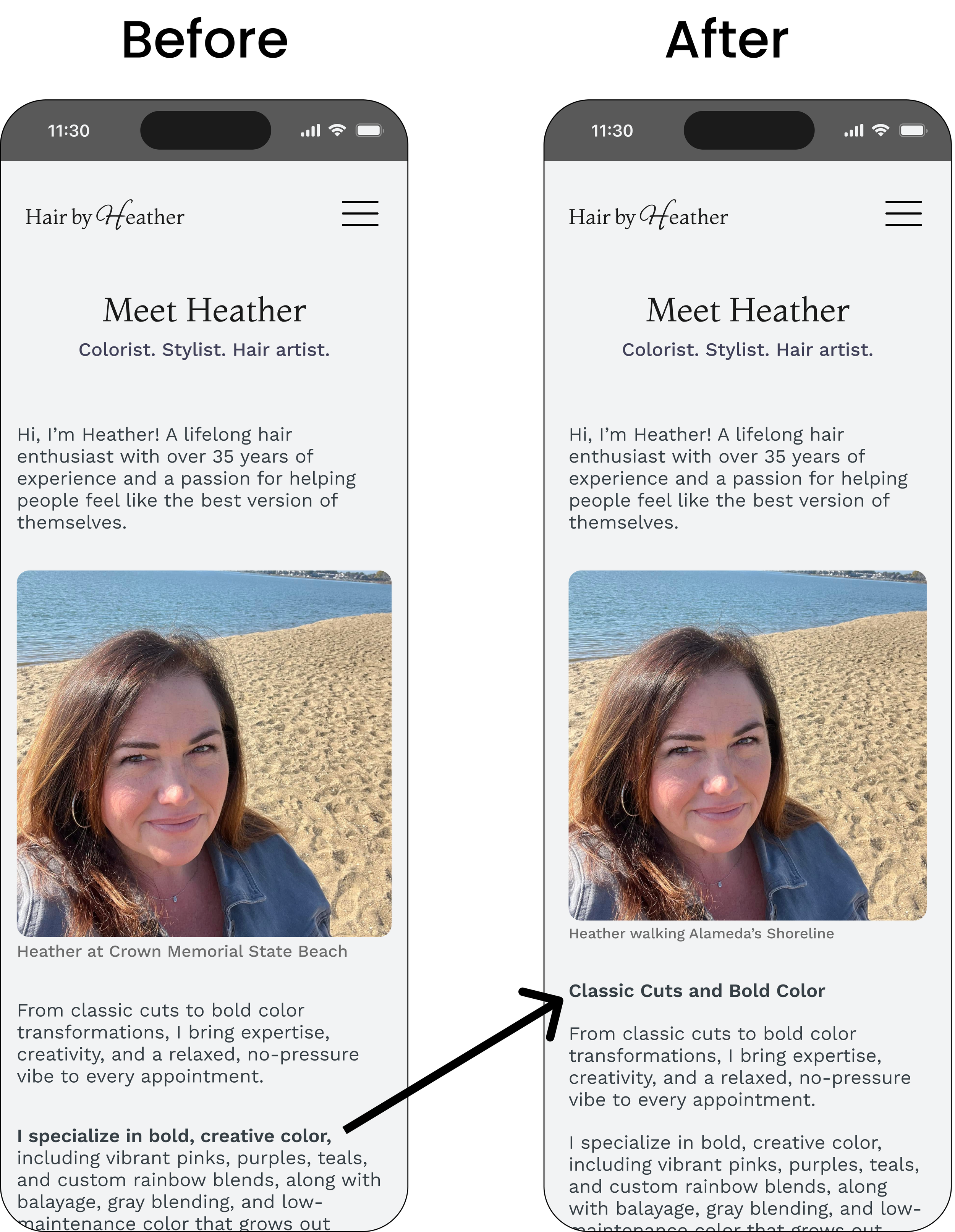
Meet Heather iterations: Subheaders for each paragraph
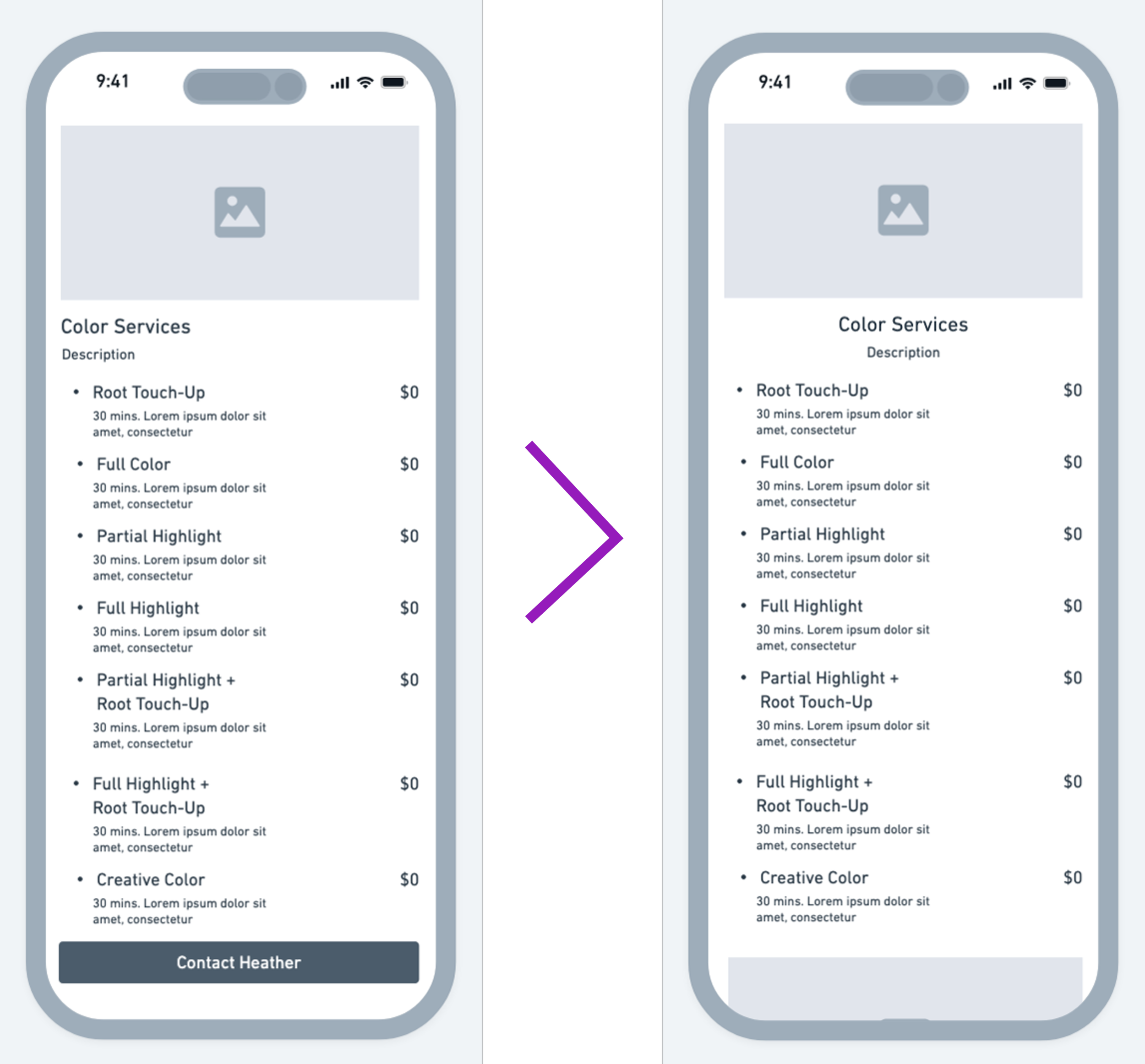
Improving the Accordion Dropdown for Service Selection
Testing Feedback: One participant suggested adding more detail to the accordion dropdown when selecting up to six services. Based on additional feedback from designers, I updated the dropdown to include each service’s description and price.
Iterations: Added service details to improve clarity during selection.
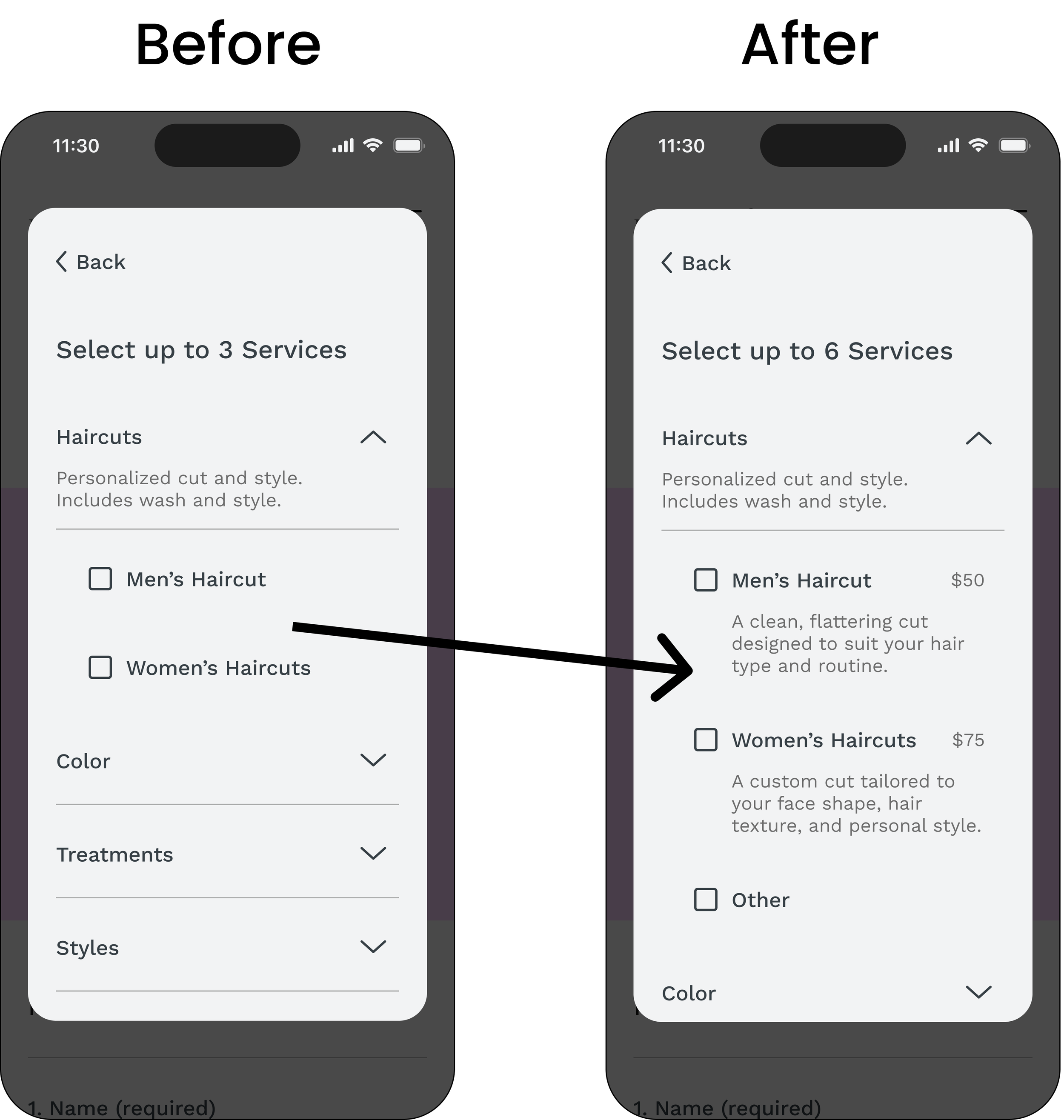
Accordion dropdown iteration: Service descriptions and pricing added
A Final Design That Pops With Personality
The finished site is responsive, easy to navigate, and infused with Heather’s unique style. It builds trust, supports communication, and turns curiosity into contact.
Outcomes
Delivered a responsive site and online strategy to help Heather build trust and attract new clients.
Analyzed 4 competitor sites and conducted 1 round of user interviews.
Designed 7 pages: Home, Services, Meet Heather, Gallery, FAQs, Policies, and Contact Form flow.
Developed the visual identity, including logo, color palette, and selected typography.
Ran 2 usability tests (low-fi and high-fi) to refine layout and content.
Reflection
This project offered more than a chance to design. It became an exercise in leading with empathy, making independent decisions, and translating user needs into a clear visual and functional experience.
Limited client feedback required initiative across every step, from writing copy to directing layout and branding. Testing and research guided the vision, but the final result came from a careful blend of creative judgment and real-world constraints.
The project delivered a solution that serves users well and fits Heather’s business today, while laying the groundwork for what comes next.
More case studies