
Case Study
A Speculative Feature to Improve Network Recall on LinkedIn
Memory Aids: A simple way to remember how you know your connections on LinkedIn’s mobile app.


Team
Samaria Berry
Timeline
4 weeks
Tools
Figma, Figjam, Zoom, Lyssna
Role
UX/UI Designer, Researcher
LinkedIn Memory Aids is a self-initiated feature add-on designed for LinkedIn’s mobile app. It allows users to attach quick, 30-character-or-less memory aids to connection profiles, helping them recall how they know someone or why they connected. These short, personalized tags appear directly on a person’s profile, offering context such as “Met at UX Meetup” or “Referred by Ana.” The feature adds lightweight, glanceable context that makes professional outreach feel more personal and intentional.
Overview
As networks grow, many LinkedIn users struggle to remember how they know certain people or how they initially connected. That missing context can make it harder to confidently re-engage, especially when reaching out for job opportunities, networking, or simply glancing at someone’s profile after time has passed.
Challenge
Usability testing showed a 100% task completion rate across two tasks, with an average satisfaction rating of 4.6 out of 5. Participants said the feature reduced friction during outreach, boosted confidence when reconnecting, and made their networks feel more personal and easier to navigate.
Impact
Rebecca has over 1,000 LinkedIn connections and often forgets how she connected with each person in her network.
HMW: How might we help her recall those initial connections, so she can maintain meaningful connections and use her network more effectively for career growth and general networking?
1. Discover
Filling the gaps in LinkedIn's networking experience.
User Interviews: Initial Assumptions vs. Actual User Insight
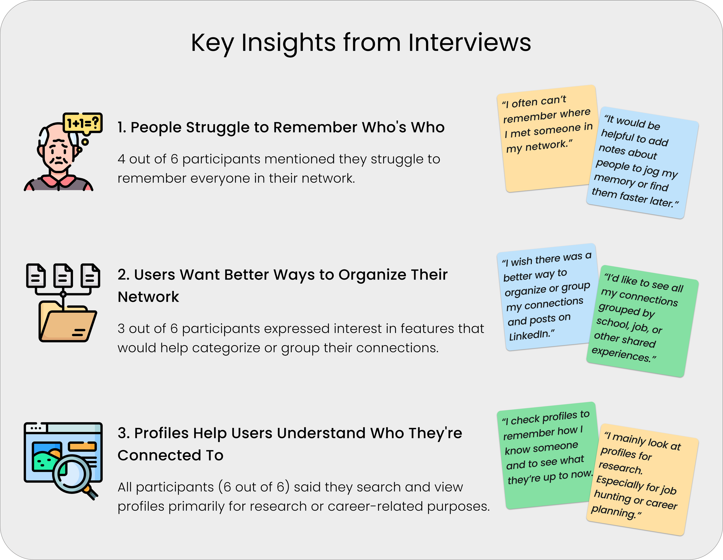
After competitive research, I interviewed 6 LinkedIn users, ranging from their late 20s to early 50s, over Zoom. The initial assumption was that users wanted better ways to organize or categorize their networks. In reality, the interviews revealed a more specific pain point. Users were not just looking for better ways to sort their connections. They were struggling to remember who people were.
Common behaviors and pain points included:
Forgetting who connections are.
Hesitating to reach out when they can’t recall the context.
Using search rather than scrolling through their connection list.
Looking at profiles to jog memory or figure out the original connection.

Interview quotes showing how lack of memory support affects outreach.
The Spark: Seeing the Problem Firsthand
Coming from a sales background, I used LinkedIn daily for outreach. Over time, I noticed a recurring problem: there was no simple way to keep track of how or why I connected with someone.
In sales, tools like Salesforce helped track relationship history, but LinkedIn didn’t offer similar context for personal or professional networking. Outside of work, I felt overwhelmed by my 1,000+ connections. Many were added during outreach, making it difficult to distinguish between real contacts and one-off connections or complete strangers.
Competitive Research: What Others Are Doing
To explore this gap further, I analyzed four indirect competitors that offer features for tagging, sorting, and tracking contacts. While these platforms serve different purposes, they reflect a common user need: lightweight systems for organizing and revisiting content with context.
Early Hypothesis
This research revealed an early hypothesis: LinkedIn users lack a simple and intuitive way to manage or revisit connections with meaningful context. That hypothesis informed the interview questions and guided the research.

Competitive Analysis of 4 companies: Google, Microsoft, Pinterest, and Evernote.
2. Define
Turning research into direction.
Distilling Patterns Through Affinity Mapping
Affinity mapping helped distill key themes across user interviews. While some users showed interest in organizing their network, memory recall came through as the more urgent need.
These insights directly shaped the problem statement and user persona. The idea of short, glanceable tags, later called Memory Aids, became the foundation for a feature that supports both recall and organization without adding friction.
3 key insights from user interviews.
Introducing the Concept of Memory Aids
The idea of short, glanceable tags emerged as a solution supporting memory recall and simple grouping. This formed the foundation for the Memory Aids feature, which aimed to reduce friction without adding complexity.
User Persona: Rebecca Adams, “Professional Networker”
To humanize these insights and guide design decisions, I created a persona named Rebecca Adams. She frequently adds new LinkedIn connections but often forgets how she knows them. Rebecca values relationship-building but needs a quick way to jog her memory. Her behavior and needs helped shape the flow, placement, and simplicity of the Memory Aids feature.
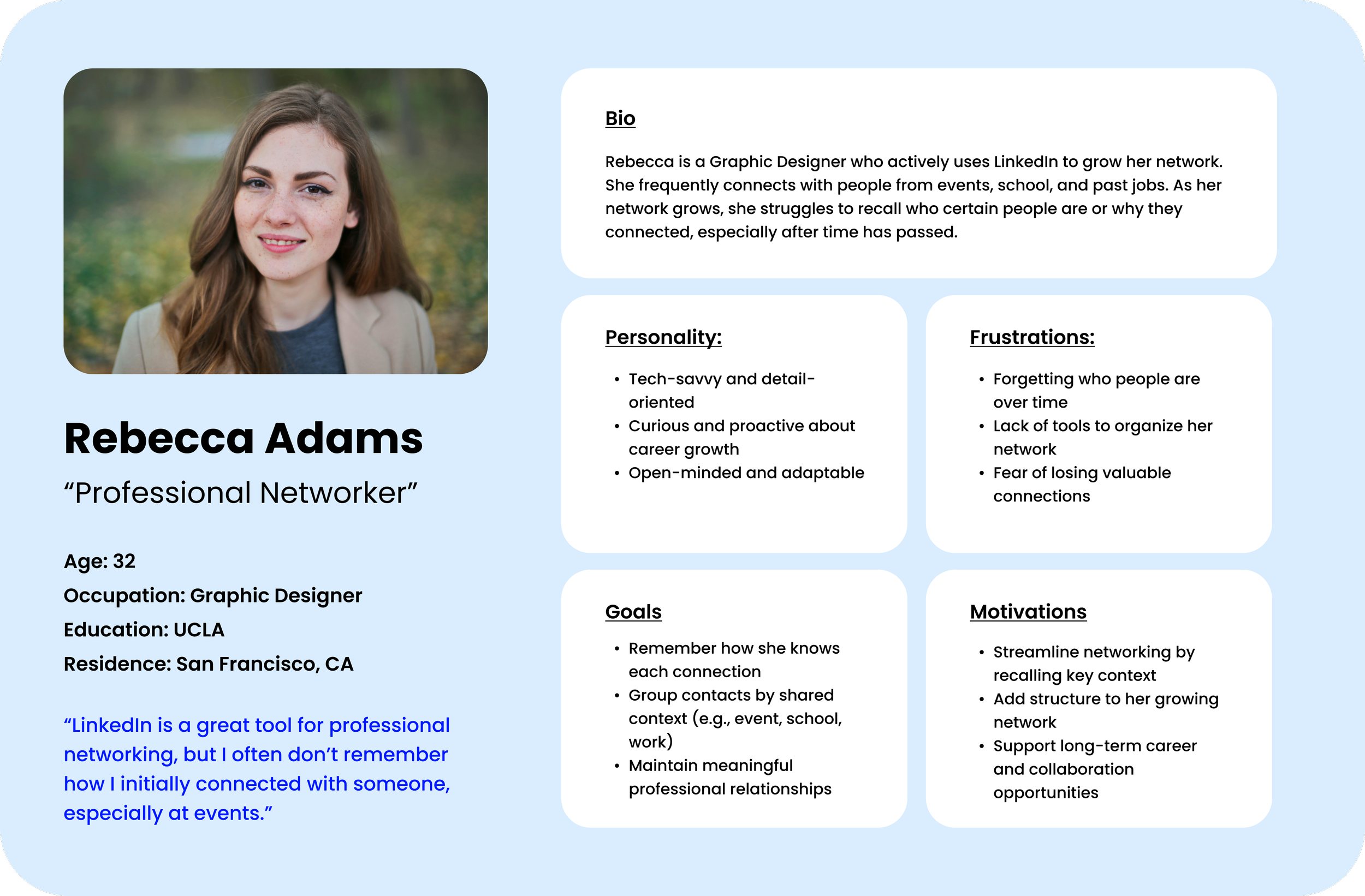
User persona that guided the design of Memory Aids.
3. Develop
Sketching ideas.
Sketches and Early Concepts
Early sketches explored how and where users might access Memory Aids. The initial concept placed an “Add Tag” option in the Connections list, accessed through a three-dot menu next to each name. At this point, the feature was simply called “Tags.”


Memory Aids (formerly Tags) page layout sketches.

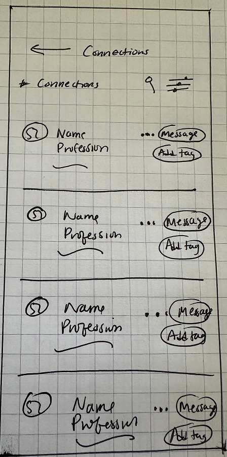
“Add tag” CTA layout sketches on Connections page, later moved to profile view and renamed “Add Memory Aids”.
Refining Placement Based on Behavior
After revisiting user interviews and peer feedback, I realized this placement didn’t reflect how people actually use LinkedIn. Most users search for names directly rather than scrolling through their full connection list. This insight prompted a major shift. I moved the feature to individual profile pages, where users naturally go to find information.
4. Deliver
Bringing everything together.
User Flows
I created two core flows:
Adding a memory aid to a connection’s profile.
Sorting the connection list by memory aids using LinkedIn’s existing “Sort by” menu, accessed via the icon next to the search bar on the Connections page.
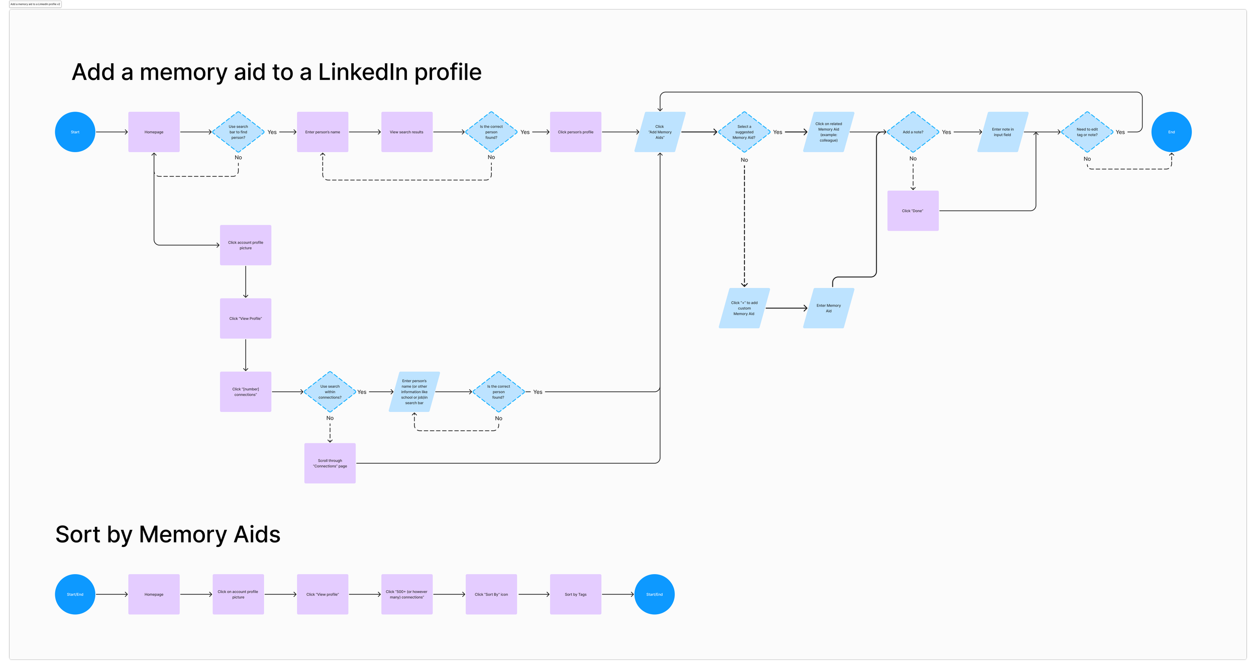
Top: User Flow Bottom: Task Flow. View both in FigJam here.
Low-Fidelity Wireframes
Early wireframes show “Add Memory Aids” in the Connections list. This placement allowed users to add and sort memory aids in one place, since LinkedIn’s existing “Sort by” feature is also located there. The feature was later moved to profile pages based on user behavior observed in research.

Flow based on early sketches. First 3 images in flow are LinkedIn screenshots.
High-Fidelity Wireframes
Feature #1: Memory Aids
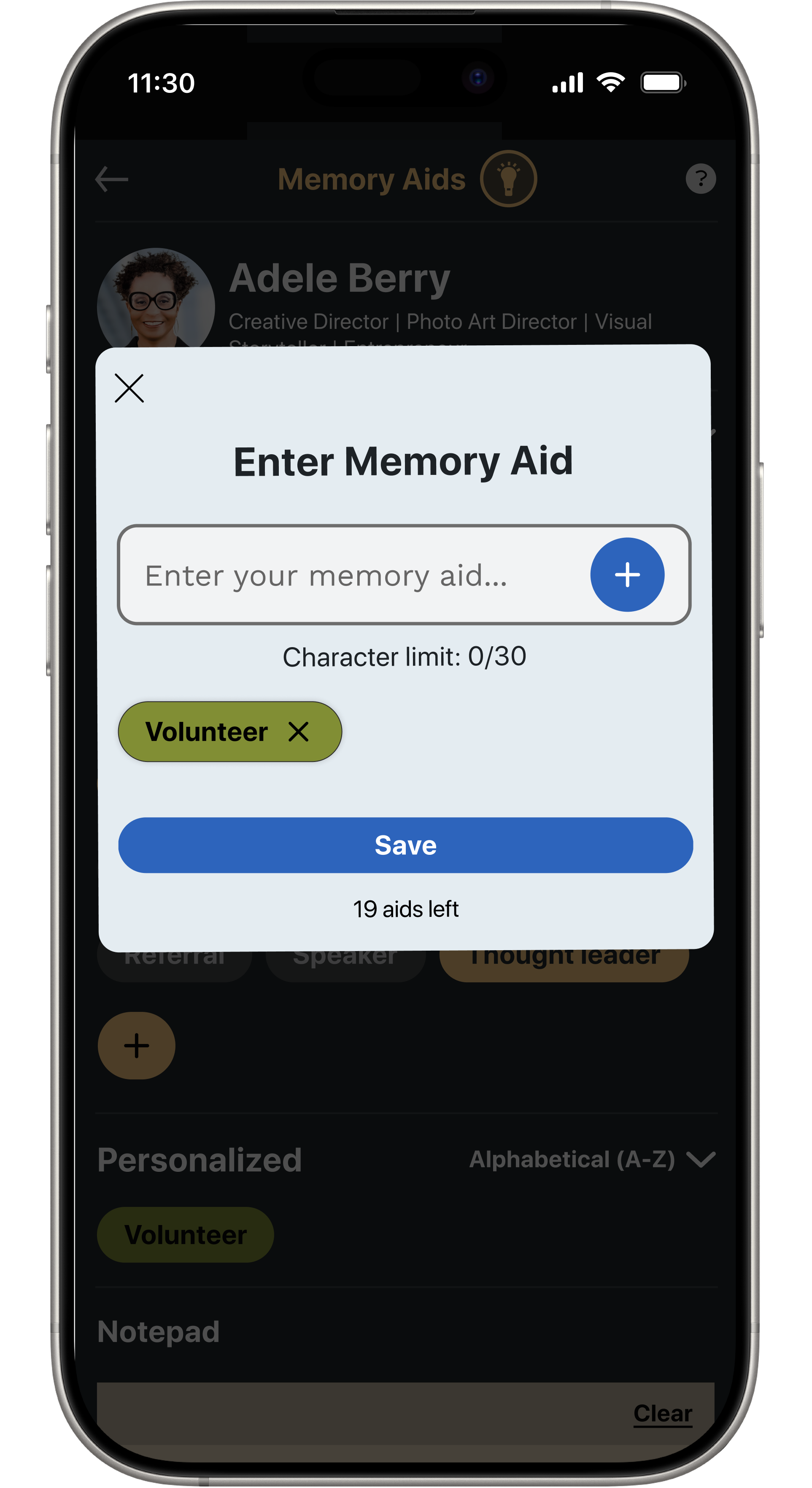
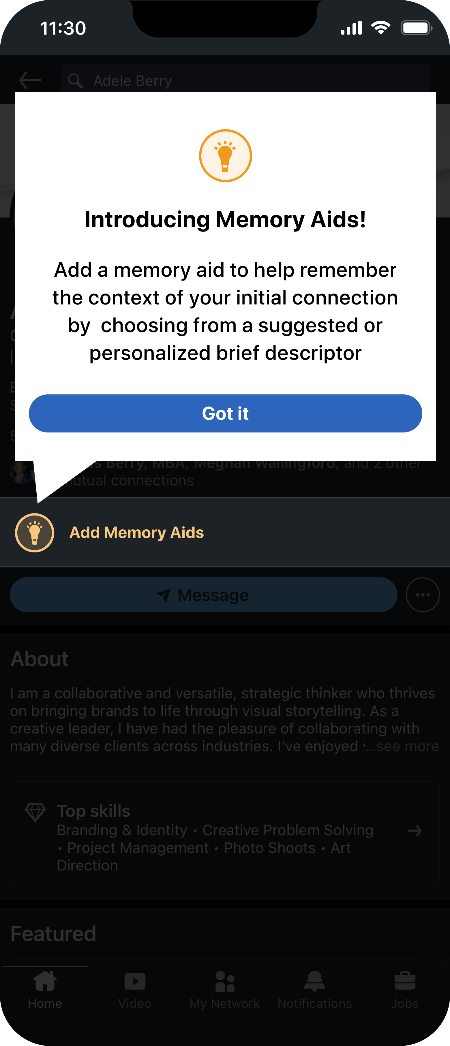
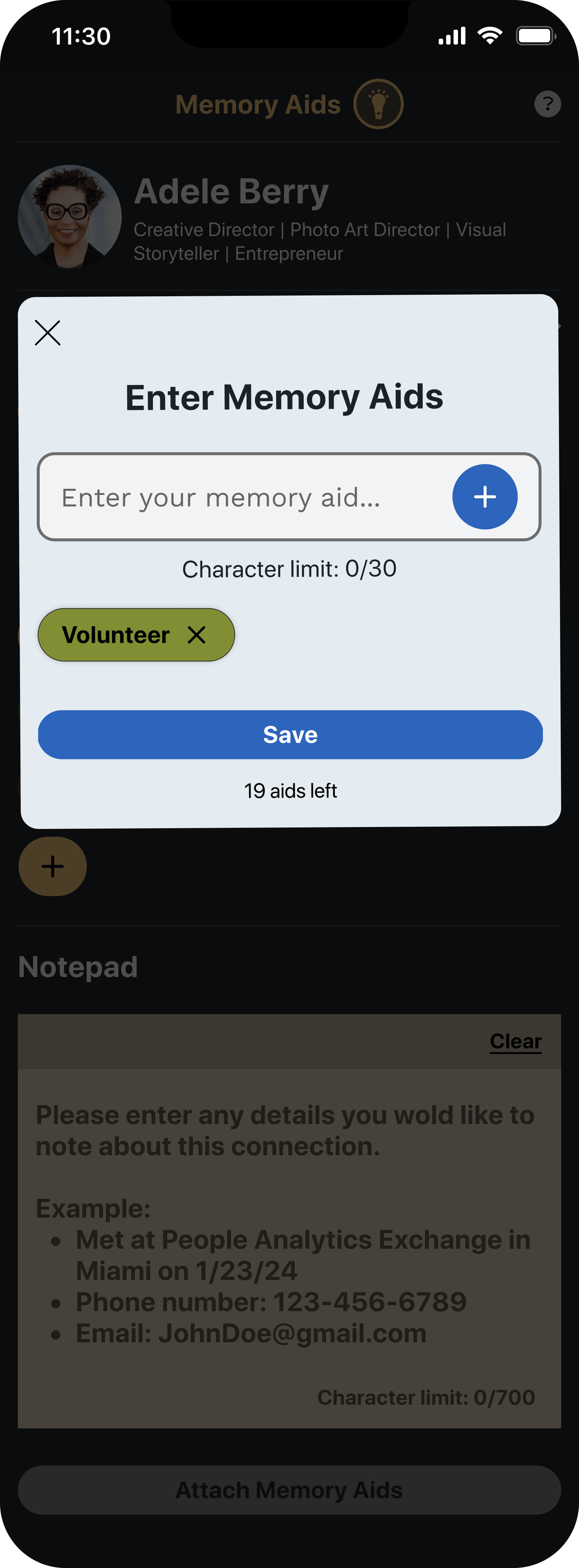
The refined version places the feature directly on profile pages, where it feels more contextual and accessible. A lightbulb icon labeled “Add Memory Aids” opens a section with suggested tags, a button to add custom ones, and an optional notepad for extra context.
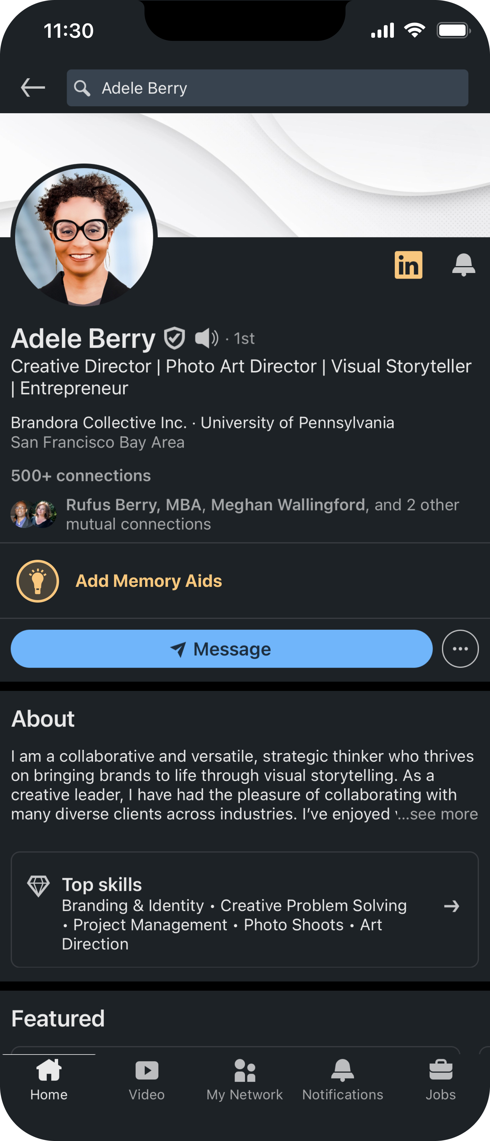
1. Profile page
2. Tool tip
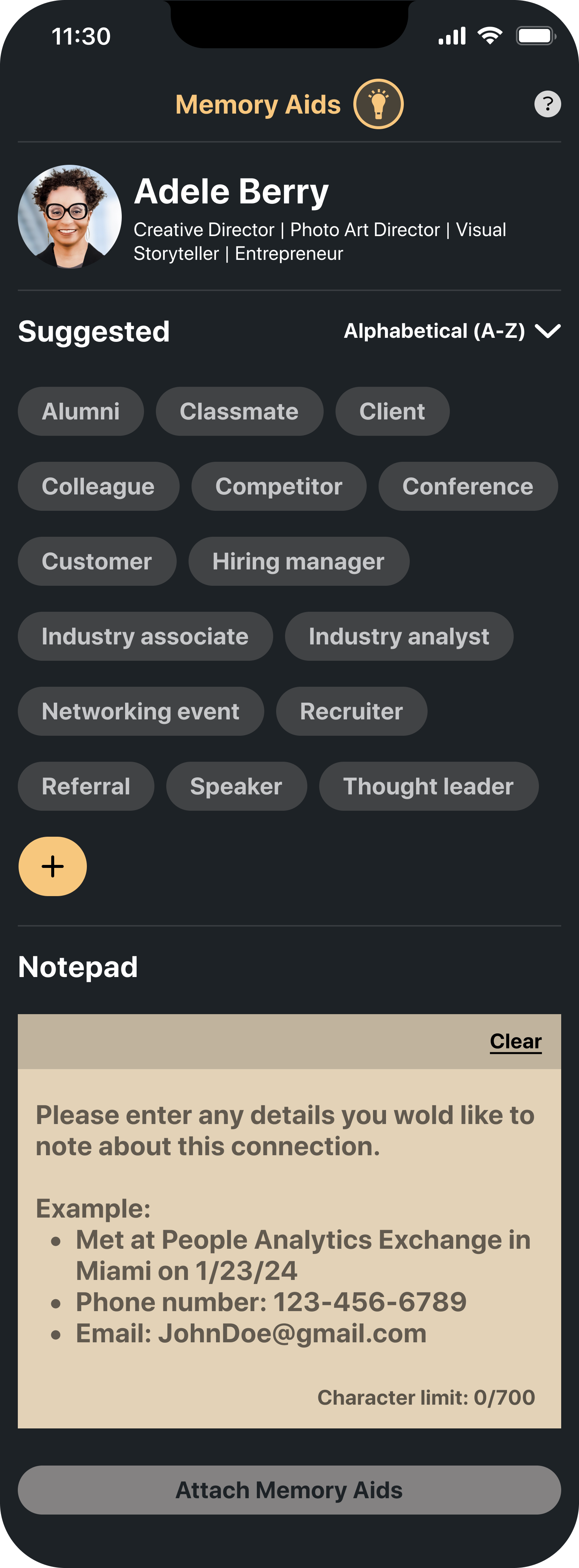
3. Memory Aids page
4. Enter Memory Aids
5. Selected Memory Aids
6. Memory Aids on profile
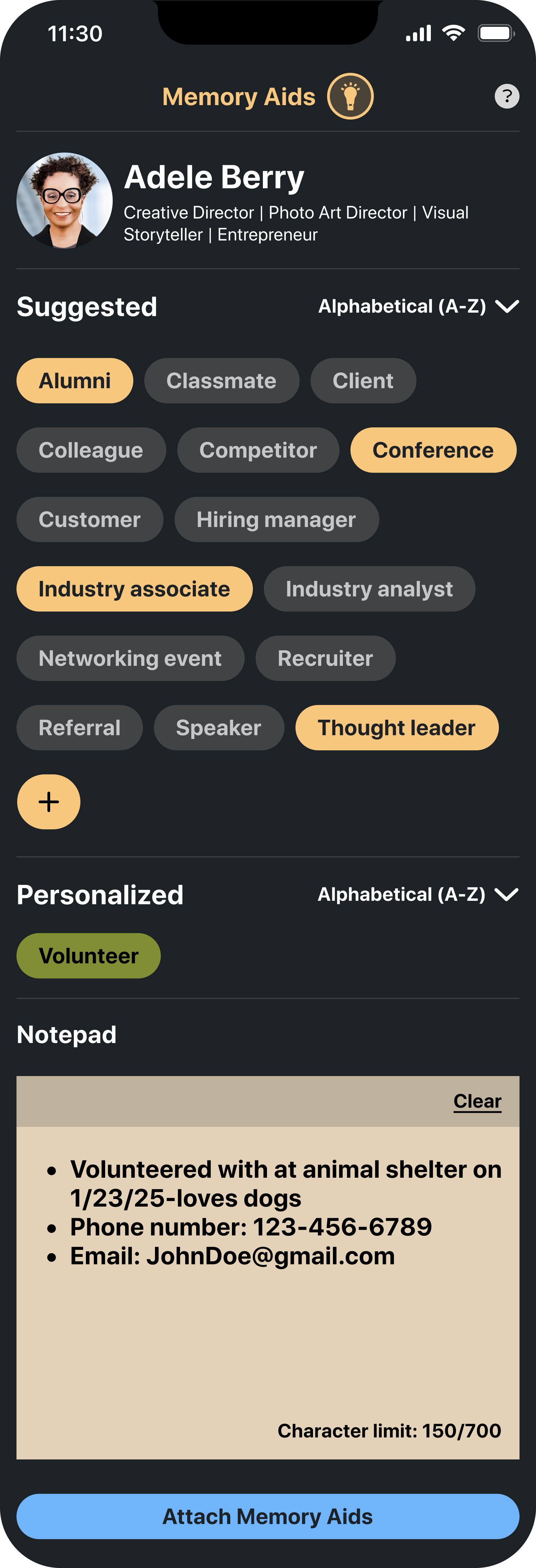

Images 1-6: High-fidelity flow of adding Memory Aids to a profile (dark mode).
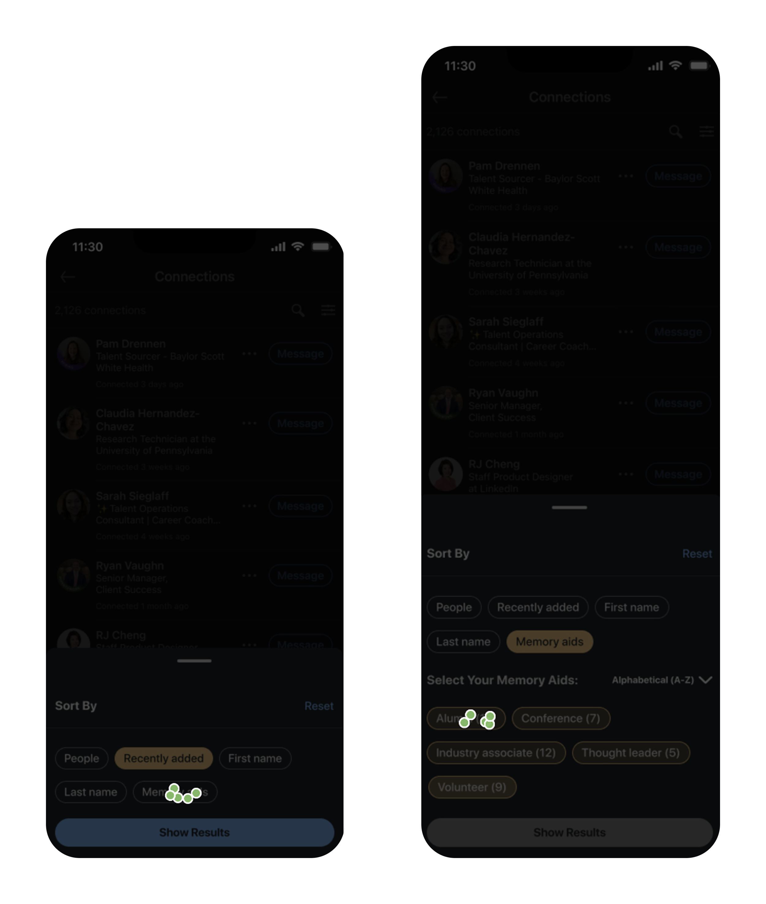
Feature #2: Sort by Memory Aids
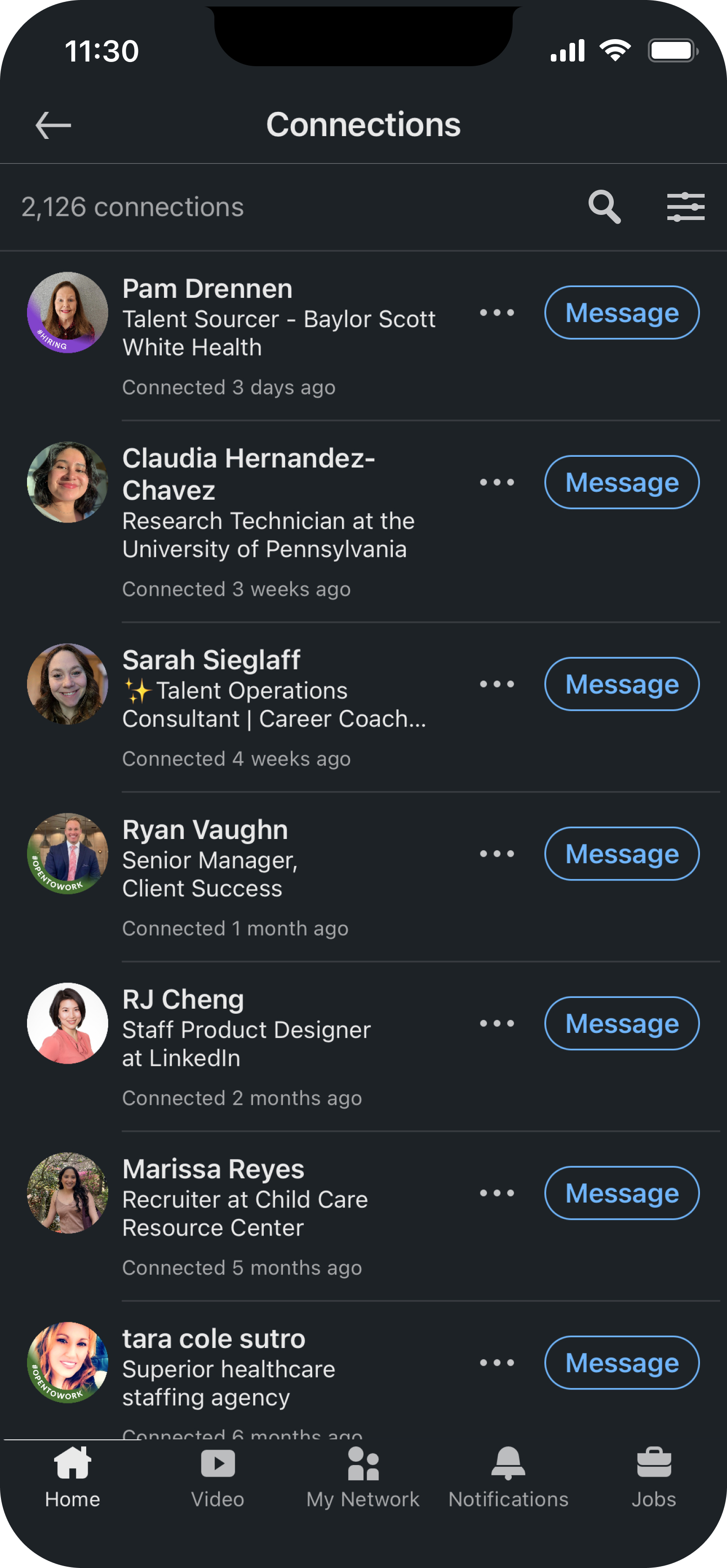
To support recall and prevent the feature from getting buried in advanced filters, I added “Memory Aids” as a new option in LinkedIn’s existing Sort by menu for the mobile app. This menu appears as a bottom sheet when users click the sort icon on the Connections page. Placing the feature here kept it visible if users need help recalling context while reviewing their connections.
1. Connections list page
2. Sort By bottom sheet

3. Memory Aids filters selected
4. Memory Aids filter applied
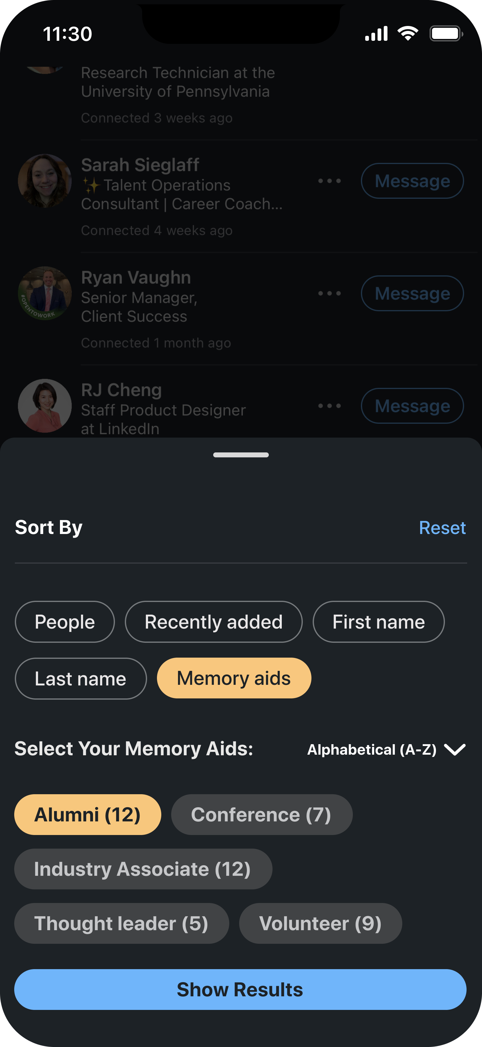

Images 1-4: High-fidelity flow of sorting by Memory Aids (dark mode).
Designing Within Constraints
Without access to LinkedIn’s official design system, I used screenshots to recreate key UI elements and maintain a native look. This constraint sharpened my attention to spacing, typography, and layout while allowing the feature to feel visually consistent with the platform.
Usability Testing
I ran two rounds of usability testing:
Round 1: 3 moderated sessions.
Round 2: 5 unmoderated tests.
The second round revealed key patterns in behavior and areas for improvement.

High-fidelity usability test results. View full results from Lyssna here.
What Worked and What Needed Improvement
Task 1: Adding a Memory Aid
All users successfully added a memory aid and understood its purpose. However, many misclicked when prompted to add a note in the notepad. The visual competition between the Suggested Memory Aids at the top of the page and the notepad positioned below likely caused this confusion.
While users liked the notepad, further testing could determine whether its placement supports the intended flow or needs refinement.

Lyssna heat maps showing tap behavior during user testing.
Task 2: Sorting by Memory Aids
Users quickly found the new “Memory Aids” option in the Sort by menu on the Connections page. While intended as a supplementary feature, it helped participants group their connections by shared memory aids and surface relevant contacts without needing to recall names or dates.
Lyssna heat maps showing tap behavior during user testing.
Design Iterations from Usability Testing
Iterations: Guiding Focus with a Simple Cue
To clarify visual hierarchy, I added the word “optional” in parentheses next to the notepad. This nudges users to focus on the main task, selecting or entering a memory aid, while signaling that the note was a secondary step.
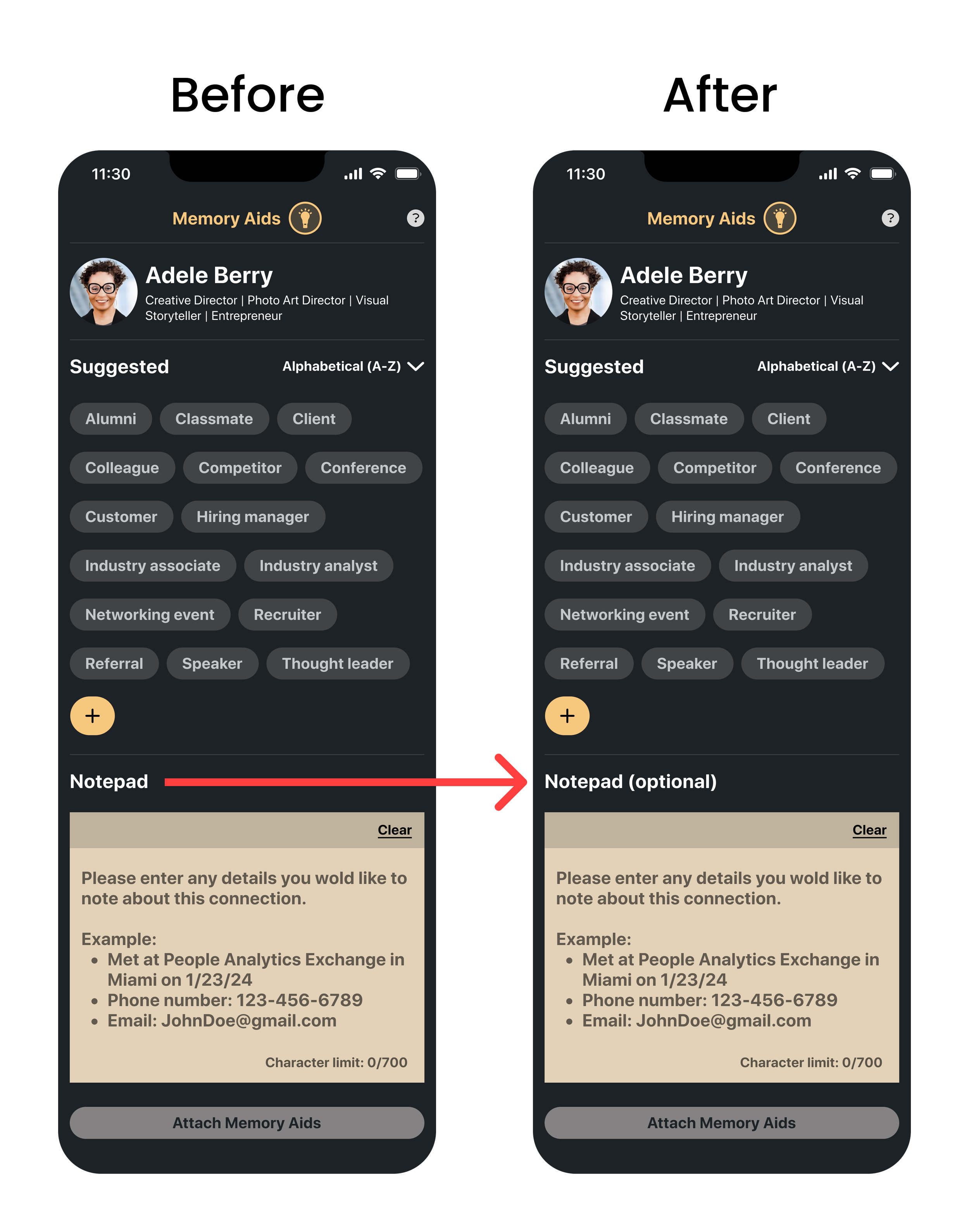
Label update: 'Optional' added to Notepad label.
Iteration: Memory Aids Input Restyle
I also restyled the memory aid input field to improve visibility and encourage interaction.
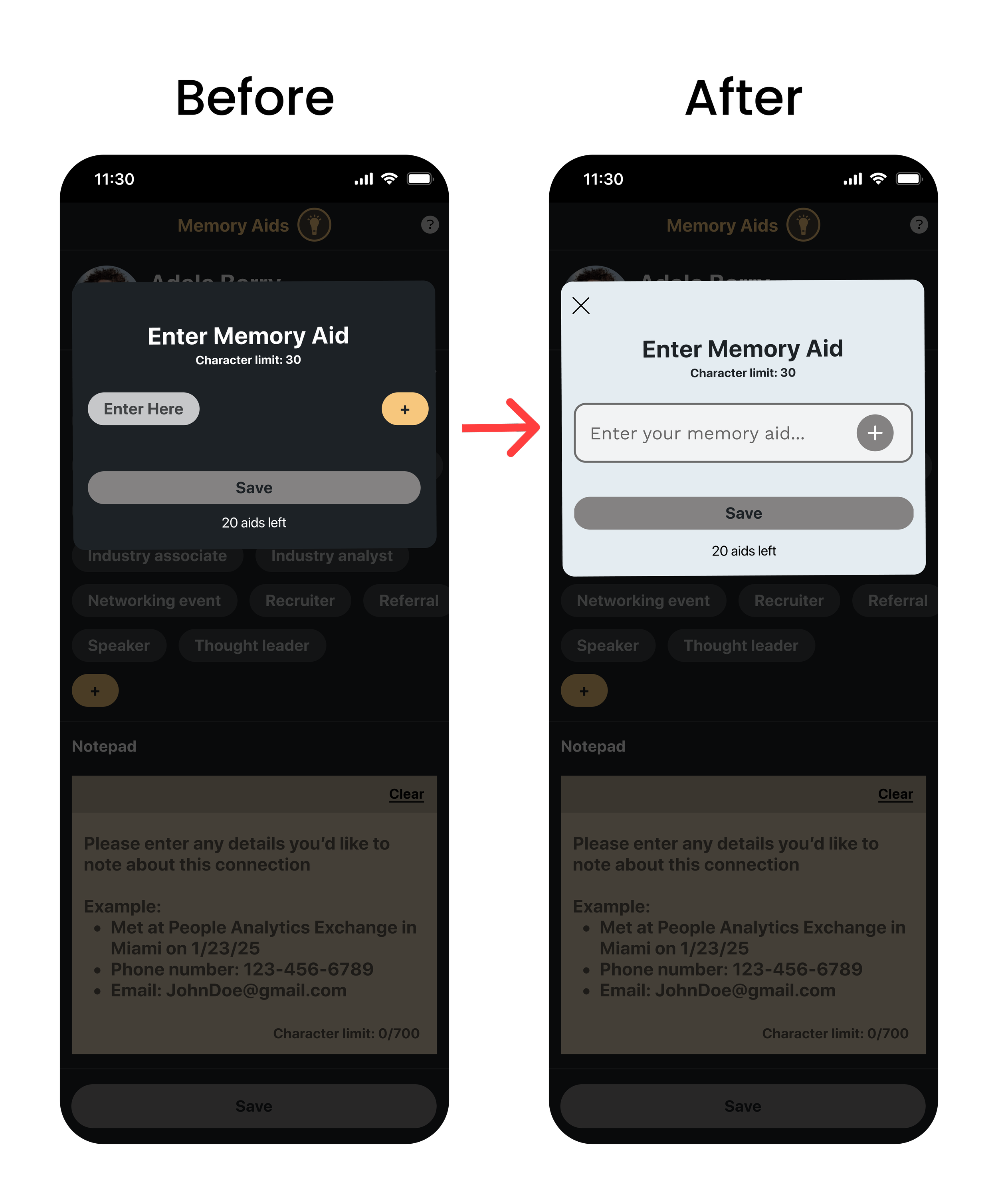
UI update: Memory Aid input field redesign.
The Final Design
The final prototype mirrors LinkedIn’s interface and lets users add context-rich memory aids, then sort their network by those cues.
Outcomes
Received an average user satisfaction rating of 4.6 out of 5 across both tasks.
Identified memory recall as the core user need through 6 user interviews.
Created 1 user persona and 2 user flows (adding and sorting memory aids).
Built and tested low- and high-fidelity prototypes with 8 users.
Conducted 2 rounds of usability testing (3 moderated, 5 unmoderated) and uncovered usability issues that led to targeted UI refinements.

Reflection
Working without access to LinkedIn’s design system pushed me to recreate components from scratch. This helped me pay closer attention to spacing, type, and layout patterns, but also highlighted the importance of consistency in large-scale platforms.
The project also reinforced the value of aligning design decisions with actual user behavior, rather than assuming flows. By placing Memory Aids on profile pages, where users naturally go to recall context, the feature became more intuitive and frictionless than if it were buried in the Connections list.
More case studies